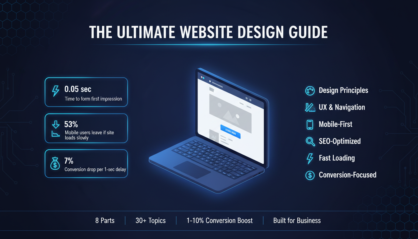
Your website is not just a digital brochure. It’s the first impression most people will ever have of your business, and in most cases, it decides whether they stay or leave within seconds.
Studies show that users form an opinion about a website in less than 0.05 seconds. That’s faster than a blink. If your site looks outdated, loads slowly, or feels confusing to navigate, visitors don’t give you a second chance. They hit the back button and go to your competitor.
That’s the reality of web design today.
But here’s the good news: a well-designed website doesn’t just look good. It works. It builds trust, guides visitors toward action, and turns casual browsers into paying customers. Good web design is one of the highest-ROI investments a business can make.
Read More:
If you’re looking for a professional web design partner, see our web design services.
So what actually goes into a great website?
That’s exactly what this guide answers.
Whether you’re building your first website, planning a redesign, or trying to understand why your current site isn’t converting, this web design guide covers everything. We’re talking about the full picture: design principles, planning process, mobile optimization, SEO, conversion strategy, user experience, industry-specific needs, and more.
Here’s what you’ll learn:
This isn’t a surface-level overview. Every section is actionable. Every point is here for a reason. Let’s start from the foundation and build up.
Web design is the process of planning, creating, and arranging everything you see on a website, including the layout, colors, fonts, images, buttons, and how all of it fits together.
But it goes deeper than visuals. Good web design also includes how a site feels to use. Can visitors find what they’re looking for quickly? Does the page load fast? Does it work on a phone? All of that is part of web design.
There are two main approaches to building a website:
Custom web design means a designer or agency builds your site from scratch based on your brand, your goals, and your audience. Everything is tailored, the layout, the functionality, the user experience. You get a site that’s unique to your business and built to perform.
Website builders like Wix, Squarespace, or WordPress with drag-and-drop themes give you pre-made templates you customize yourself. They’re faster and cheaper upfront, but you’re working within limitations. The design isn’t truly yours, and as your business grows, those limitations start to show.
The right choice depends on your goals. If you’re testing an idea or just need a basic online presence, a builder might work. But if your website is a serious business tool, one that needs to generate leads, build trust, and scale with you, custom web design is the better investment.
Choosing the right platform is just as important as the design itself. If you’re weighing your options, read our in-depth Website Platform Comparison Guide to find out which platform fits your business best.
Read More:
What Is Custom Web Design
Web Designer vs. Website Builder
Great websites don’t happen by accident. They follow a set of principles that make the design both beautiful and functional.
UX Design (User Experience): UX is about designing for the person using your site, not just the person looking at it. A good UX means visitors can navigate your site without thinking too hard. They find what they need, understand what you offer, and know exactly what to do next. Every layout decision, every button placement, every page flow, it all comes down to the user’s experience.
Design Consistency: Consistency means your site looks and feels the same across every page. Same fonts, same colors, same button styles, same spacing. When your design is consistent, it feels professional and trustworthy. When it’s inconsistent, even subtly, visitors notice, and it erodes confidence in your brand.
Grid Systems: A grid is the invisible structure underneath your layout. It aligns your content into columns and rows, creating visual order. Without a grid, designs feel random and cluttered. With one, everything has a place, and the page feels balanced. Most modern websites use a 12-column grid as their base.
Visual Hierarchy: Your design needs to tell visitors where to look first, second, and third. This is done through size, contrast, spacing, and placement. Your headline should be the most prominent element. Your CTA should stand out. Secondary information should step back. When hierarchy is done right, users move through your page exactly the way you want them to.
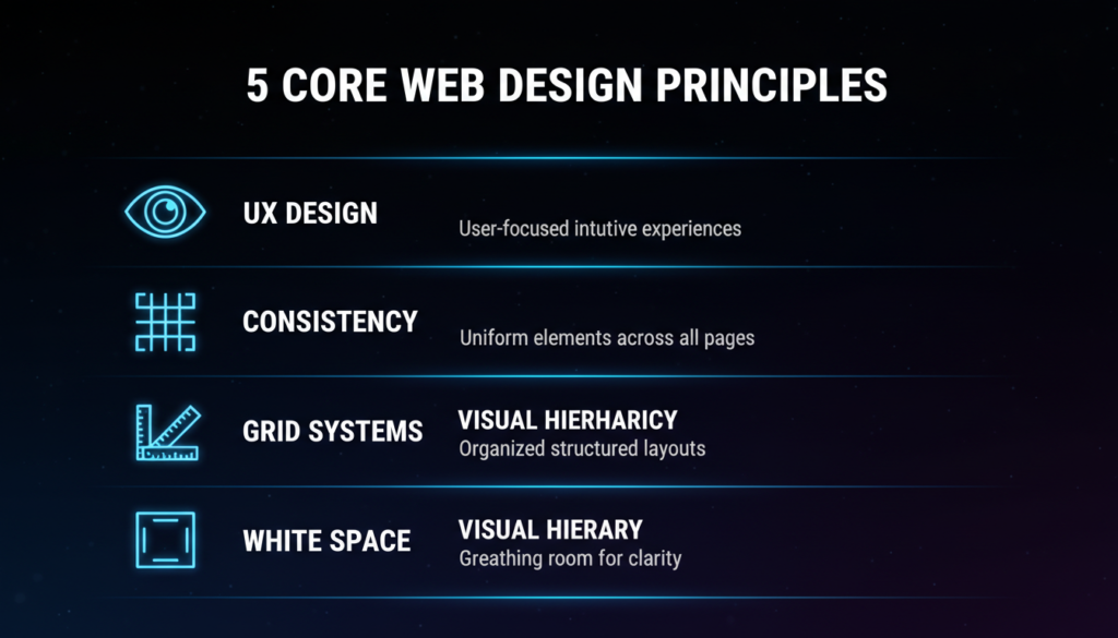
White Space: White space, or negative space, is the empty area around your content. It’s not wasted space. It’s breathing room. It makes your content easier to read, your design feels premium, and your key elements stand out. Overcrowded pages overwhelm visitors. Clean, spacious layouts build trust.
Read More:
UX Design Principles for Business Websites
The visual layer of your website, color, typography, and layout, does more than make things look nice. It communicates your brand, directs attention, and influences how visitors feel about your business.
Color is one of the most powerful tools in web design. Different colors trigger different emotions and associations.
Your color choices should match your brand personality and your audience’s expectations. A children’s toy brand and a law firm should not have the same color palette. Beyond brand fit, you also need to think about contrast. Text needs to be readable against its background. CTAs need to pop against the page. Poor color contrast is one of the fastest ways to lose visitors.
Typography is how your text looks, and it affects readability, brand perception, and user experience more than most people realize.
A few rules that matter:
Your typography should feel effortless to read. If visitors have to work to read your content, they won’t.
Layout is how you arrange elements on the page, and it directly controls how visitors move through your content.
The most effective web layouts follow a few consistent patterns. The F-pattern and Z-pattern describe how people naturally scan pages. Headlines and key information should sit in these natural scan paths. Important elements, like your value proposition and CTA, belong above the fold, visible without scrolling.
Consistent spacing between sections, between elements, and inside containers makes a design feel intentional and organized. When spacing is random, pages feel amateur, even if the individual elements look good.
A professional website design process follows a clear sequence: discovery, sitemap planning, wireframing, visual design, development, testing, and launch. Each phase builds on the one before it.
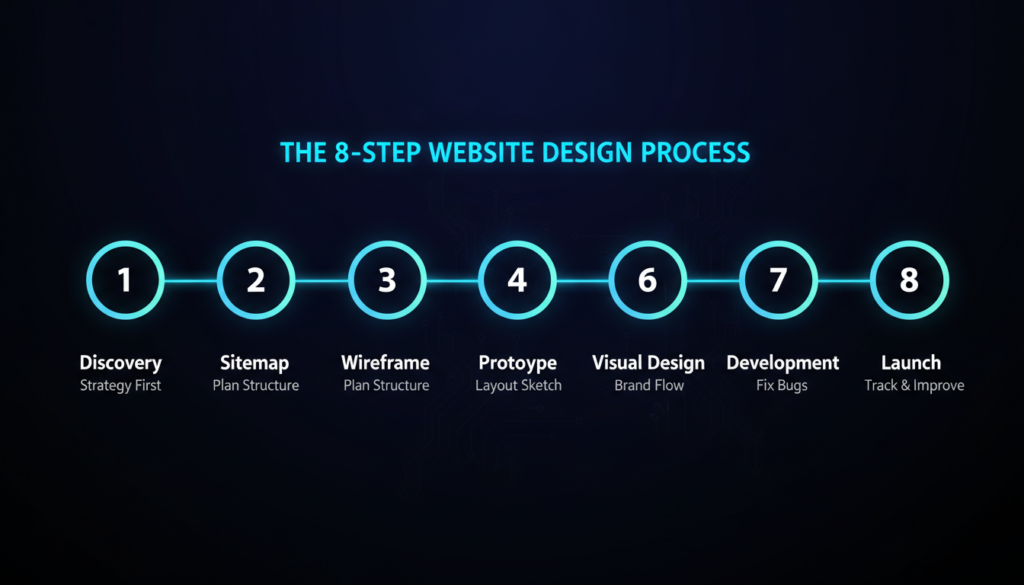
Skipping steps early on is the most common reason projects run over budget or require complete restarts. A site built without a strategy is just a page that doesn’t perform.
For a detailed breakdown of every phase, including what to prepare, what questions to ask your agency, and how long each stage takes, read our complete Website Design Process Guide.
One of the most common questions clients ask is: ” How long is this going to take?
The honest answer is, it depends. But here’s a realistic breakdown:
| Project Type | Typical Timeline |
| Simple 5-page business site | 4–6 weeks |
| Mid-size site with custom features | 8–12 weeks |
| Large eCommerce or complex site | 3–6 months |
These timelines assume smooth feedback cycles and content that’s ready on time. In reality, the biggest delays almost always come from the client side, late content delivery, slow feedback, or scope changes mid-project.
What affects your timeline the most:
A good agency will give you a realistic timeline from the start and keep you updated throughout. If someone promises a complex custom site in two weeks, that’s a red flag.
Read More:
Web design pricing confuses a lot of people, and understandably so. You can find someone to build a site for $500 or $50,000, and it’s not always obvious what explains the difference.
Here’s how to think about it.
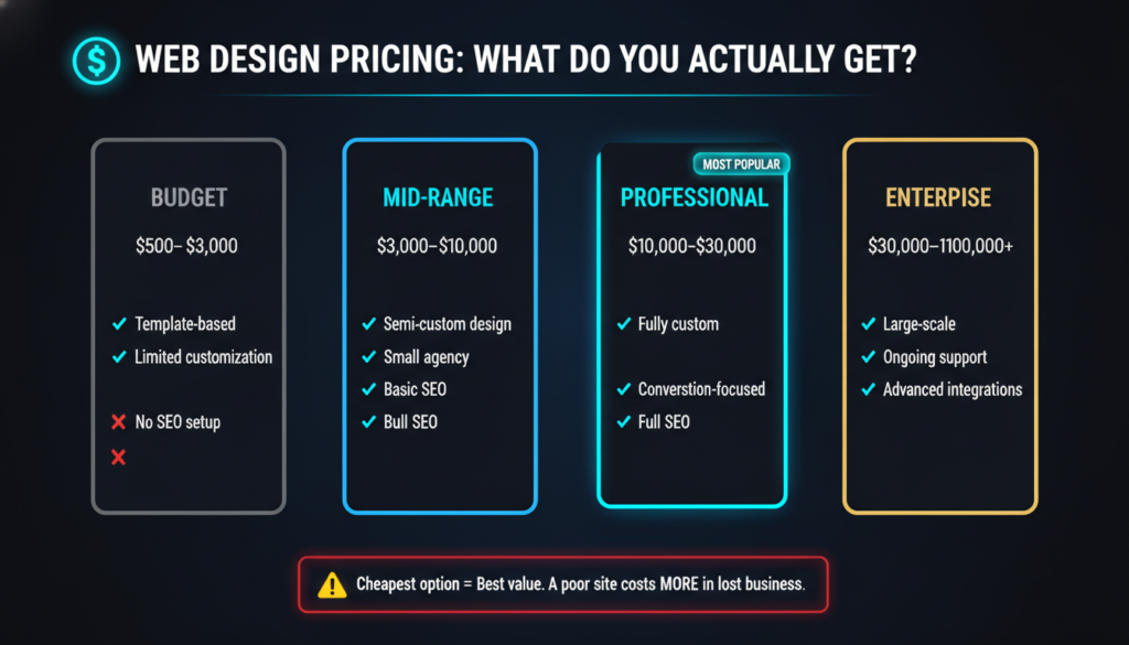
| Tier | What You Get | Typical Range |
| Budget | Template-based, limited customization | $500–$3,000 |
| Mid-range | Semi-custom, small agency, or experienced freelancer | $3,000–$10,000 |
| Professional | Fully custom design and development | $10,000–$30,000+ |
| Enterprise | Large-scale, complex, ongoing support | $30,000–$100,000+ |
The cheapest option is rarely the best value. A poorly built site that doesn’t convert costs you far more in lost business than you saved on the build.
Many agencies offer tiered packages, starter, professional, and premium, for example. When comparing packages, don’t just look at what’s included. Look at what’s not included. Some packages exclude SEO setup, mobile optimization, or post-launch support. Those omissions can cost you more to add later than if you’d chosen a better package upfront.
Read More:
Web Design Pricing
Website Design Package Comparison
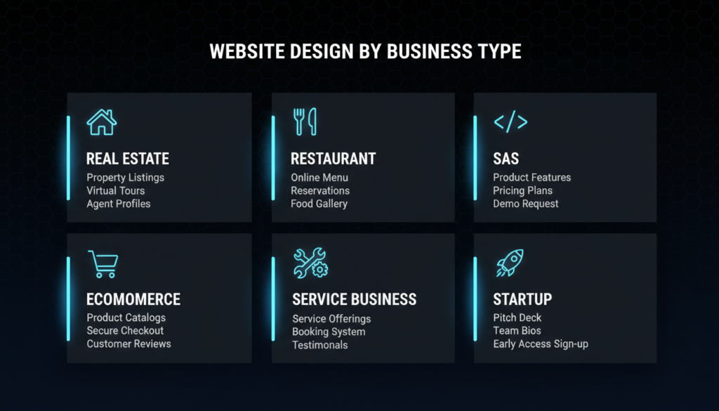
There’s no single website design that works for every business. A law firm and a restaurant have completely different audiences, different goals, and different reasons someone visits their site. Your design strategy needs to match your specific business context.
Here’s what works, and what matters most, for the most common business types.
Real estate websites live or die on property presentation and lead capture. Visitors come to browse listings and inquire about properties. Your design needs to make both of those things effortless.
What matters most:
The biggest mistake real estate sites make is burying contact options. Every listing page should make it dead simple to get in touch or book a viewing.
Read More:
Restaurant websites have one primary job: get people through the door or on the phone. That means your menu, location, hours, and reservation system need to be front and center, immediately visible, no hunting required.
What matters most:
A common mistake is over-designing restaurant sites with heavy animations and slow load times. Atmosphere matters, but not at the cost of function.
Read More:
Custom Web Design for Restaurants
SaaS websites need to do something harder than most: explain a product that visitors can’t physically see or touch, and convince them it’s worth their time and money. Clarity is everything.
What matters most:
SaaS sites also tend to have longer sales cycles, especially for B2B. Your design needs to nurture visitors who aren’t ready to buy yet, through resources, email capture, and retargeting-friendly content.
eCommerce design is directly tied to revenue. Every design decision, from product page layout to checkout flow, affects whether someone buys or abandons their cart.
What matters most:
The checkout process deserves special attention. Every unnecessary field, every extra step, every moment of friction is an opportunity for the customer to leave. Simplify ruthlessly.
Service businesses, agencies, contractors, consultants, and home services need their website to generate leads. The entire site should be designed around one goal: getting qualified people to contact you.
What matters most:
The more specific your site is about who you help and what results you deliver, the better it converts. Generic service pages don’t build trust.
Small business websites often try to do too much with too little. The temptation is to pack every page with information. The reality is that simplicity wins.
What matters most:
Small businesses don’t need flashy sites. They need clear, fast, trustworthy sites that rank locally and convert visitors into customers.
Startup websites often serve multiple audiences at once- potential customers, investors, and potential hires. That makes the design challenge more complex than most.
What matters most:
Startups live on momentum and credibility. Your website needs to make you look like a real, serious business, even when you’re still small.
One person rarely makes B2B buying decisions, and they’re rarely made quickly. Your website needs to serve multiple stakeholders- the user, the decision-maker, the finance team, and support a longer, more research-heavy buying process.
What matters most:
In B2B, your website often needs to do the work of an early-stage sales rep. It needs to educate, build trust, and move prospects forward, even when your sales team isn’t in the room.
At some point in the planning process, most businesses face the same decision: go custom or use a template?
Templates are appealing for obvious reasons. They’re faster, cheaper upfront, and don’t require a designer. But they come with a ceiling, and most growing businesses hit it faster than they expect.
What custom web design actually gives you:
It’s built around your goals. A template is designed to work for anyone. A custom site is designed to work for you, your audience, your conversion goals, and your brand. That specificity matters.
It reflects your brand accurately. Your website is often the first place people form an opinion about your business. A generic template says, “We couldn’t be bothered.” A custom design says “we take our business seriously.” Brand perception is hard to put a number on, but it’s real.
It performs better. Custom sites are typically faster, cleaner in code, and easier to optimize for SEO. Templates often come with bloated code that slows your site down and creates technical debt.
It scales with you. As your business grows, your website needs to change. Custom-built sites are far easier to expand, integrate with other tools, and adapt to new requirements.
It converts better. Every layout decision, every CTA placement, every piece of copy on a custom site is intentional. That intentionality translates into better conversion rates.
A $15,000 custom website that converts 3% of visitors is worth far more than a $2,000 template site that converts 0.8%. When you look at it in terms of leads generated and revenue driven, the math usually favors custom.
If you’re ready to invest in a custom website built around your business goals, explore our web design services.
Read More:
User experience, UX, is the single most important factor in whether your website actually works. A site can look stunning and still fail if visitors can’t figure out what to do, where to go, or why they should stay.
UX is not a design style. It’s a discipline. It’s the practice of understanding how real people think, behave, and make decisions, and then designing around that reality.
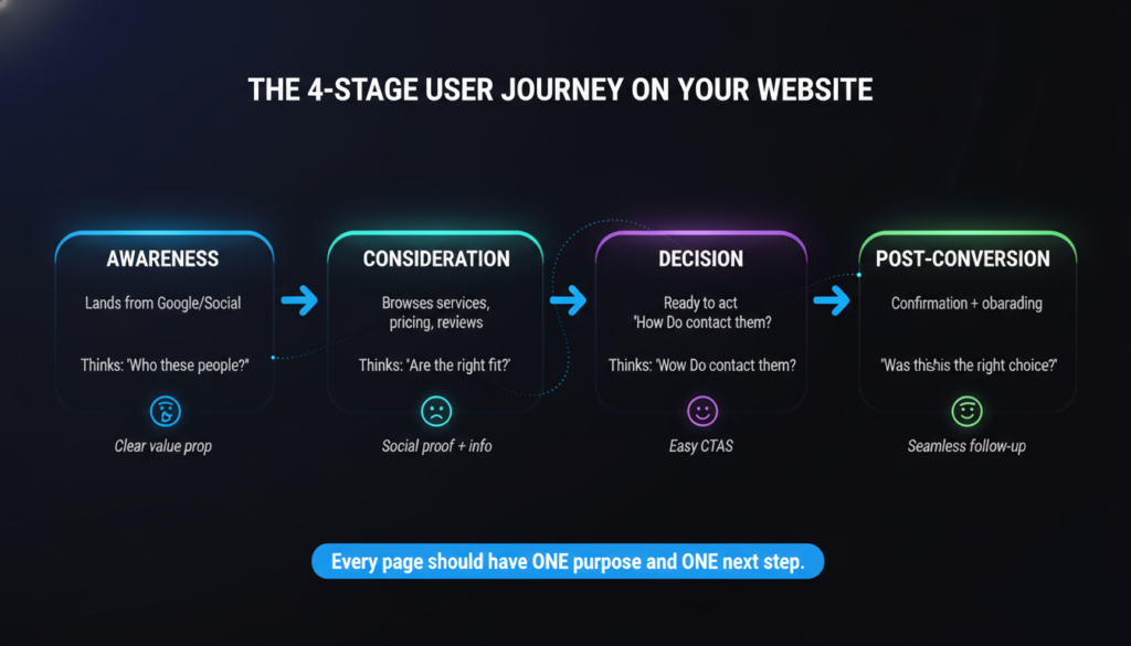
Every visitor who lands on your site is on a journey. They came from somewhere- a Google search, a social media post, a referral, and they’re trying to do something. Find information. Solve a problem. Compare options. Make a purchase. Book a service.
Your job as a website owner is to make that journey as smooth and frictionless as possible.
A user journey map outlines every step a visitor takes from the moment they arrive to the moment they convert, or leave. It identifies what they’re thinking, what they need, and where they might get stuck or frustrated.
Common stages in a typical user journey:
When you design with the user journey in mind, every page has a clear purpose and a clear next step. Nothing is there just to fill space.
Most bad UX decisions come from designing based on what the business wants to show, not what the user needs to see. The product page that lists every feature instead of answering “will this solve my problem?” The homepage leads with the company’s history instead of the customer’s pain point. The contact page is buried three clicks deep.
Good UX requires you to step out of your own perspective and think like a first-time visitor who knows nothing about your business. (according to Nielsen Norman Group’s UX research)
A few principles that hold across almost every website:
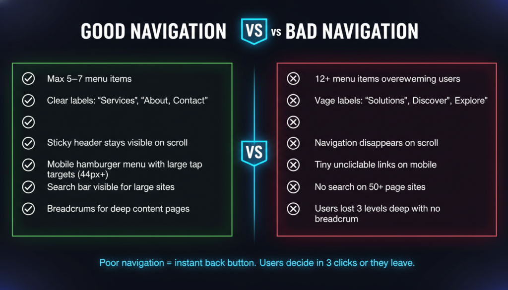
Navigation is the backbone of your website’s usability. If visitors can’t find their way around, nothing else matters, not your design, not your content, not your offers.
Good navigation is invisible. When it works, users don’t notice it. They just move through your site naturally and find what they need. When it fails, it’s immediately frustrating.
The main menu should have no more than five to seven items. Every item you add beyond that increases cognitive load and makes it harder for visitors to decide where to go.
Prioritize ruthlessly. What are the most important pages for your visitors? Those go in the main nav. Everything else gets tucked into secondary navigation, the footer, or internal links within pages.
Avoid clever or vague labels. “Solutions” tells a visitor nothing. “Services” is clear. “Discover” is vague. “About Us” is clear. When in doubt, use the obvious word.
Dropdown menus can be useful for sites with lots of content. But they add complexity, and they often fail on mobile. If you use them, keep them shallow; one level deep is almost always enough. Multi-level dropdowns (hover over a dropdown to reveal another dropdown) are a usability nightmare.
A sticky (fixed) navigation bar stays visible as users scroll down the page. For most sites, this is worth implementing. It means visitors can navigate to another section or click a CTA at any point, without scrolling back to the top. On long pages, especially, sticky navigation significantly improves usability.
On mobile, full desktop menus don’t fit. The standard solution is the hamburger menu, three horizontal lines that expand into a full menu when tapped. It’s widely understood by users and works well when implemented cleanly.
A few mobile nav rules: make touch targets large enough to tap accurately (at least 44×44 pixels), keep the menu short, and make sure the close button is obvious.
For larger sites with multiple levels of content, eCommerce stores, resource libraries, and multi-category blogs, breadcrumbs show users where they are in the site structure and give them a quick path back. They also help with SEO.
If your site has more than 20–30 pages, a search bar is worth adding. Users who search are highly engaged and more likely to convert. Make the search bar easy to find, top right of the header is the standard, expected location.
Accessibility means designing your website so that everyone can use it, including people with visual, auditory, motor, or cognitive disabilities.
This is not a niche concern. Roughly 15% of the world’s population lives with some form of disability. Beyond the moral argument, there’s a business case: accessible websites reach more people, perform better in search engines, and in many industries and regions, are a legal requirement.
The Web Content Accessibility Guidelines (WCAG) are the international standard for web accessibility. They’re organized around four principles, your site must be Perceivable, Operable, Understandable, and Robust.
Here’s what that means in practice:
Color contrast: Text must have sufficient contrast against its background to be readable by people with low vision or color blindness. WCAG requires a contrast ratio of at least 4.5:1 for normal text. Light gray text on a white background fails this standard, and it’s everywhere.
Alt text for images: Every image on your site should have descriptive alt text. Screen readers, used by visually impaired visitors, read alt text aloud to describe what’s in the image. Alt text also helps search engines understand your images.
Keyboard navigation: Some users can’t use a mouse. They navigate entirely by keyboard, using the Tab key to move between elements. Your site should be fully navigable by keyboard alone. Every interactive element, including links, buttons, and forms, should be reachable and usable without a mouse.
Readable fonts and sizing: Use fonts that are clear and legible. Avoid overly decorative fonts for body text. Keep base font size at 16px or larger. Allow users to resize text in their browser without breaking your layout.
Descriptive link text: Links that say “click here” or “read more” tell screen reader users nothing. Use descriptive link text that explains where the link goes, “Read our web design pricing guide” instead of “Click here.”
Form labels: Every form field needs a visible label. Placeholder text inside a field disappears when the user starts typing; it cannot replace a label. Screen readers also rely on labels to tell users what each field is asking for.
Video captions: If your site includes video content, captions are essential for deaf or hard-of-hearing users. They’re also useful for anyone watching in a noisy environment or without headphones.
Accessible design is almost always better design. High contrast makes text easier to read for everyone, not just people with visual impairments. Clear navigation benefits all users. Descriptive labels make forms less confusing across the board.
Building accessibility into your site from the start is far easier and cheaper than retrofitting it later. If you’re planning a new site or redesign, make accessibility a requirement from day one.
A beautiful website that doesn’t convert is just expensive decoration.
Conversion-focused design means every visual decision, every layout choice, every piece of copy is made with one question in mind: Does this move the visitor closer to taking action?
That action might be filling out a contact form, booking a call, making a purchase, signing up for a newsletter, or downloading a resource. Whatever your goal is, your design should be engineered to get visitors there, clearly, quickly, and without friction.
Your conversion rate is the percentage of visitors who complete a desired action. If 1,000 people visit your site and 30 fill out your contact form, your conversion rate is 3%. The average website converts between 1–3% of visitors. Well-optimized sites regularly hit 5–10% or higher.
Even small improvements compound significantly. Going from 1% to 2% conversion rate doubles your leads without increasing your traffic at all.
People don’t make decisions purely on logic. They’re influenced by emotion, social proof, trust signals, urgency, and cognitive shortcuts. Good conversion design understands this and uses it ethically.
A few psychological principles that directly affect conversions:
Clarity beats cleverness. Visitors should understand your offer in five seconds or less. If your headline is a clever pun or a vague tagline, you’re making people work too hard. Be direct. Tell them exactly what you do and why it matters to them.
Friction kills conversions. Every extra click, every unnecessary form field, every moment of confusion is a reason to leave. Identify every point of friction in your conversion flow and eliminate it.
Trust comes before action. Nobody fills out a form or hands over their credit card to a website they don’t trust. Trust signals, reviews, testimonials, security badges, and professional design must come before your CTA, not after.
One page, one goal. Pages that try to accomplish too many things accomplish nothing. Every page should have a primary conversion goal. Everything on that page should support that goal.
Scarcity and urgency work when they’re real. Limited-time offers, low stock warnings, and deadline-driven CTAs increase conversions. But fake urgency destroys trust the moment visitors notice it. Only use these tactics when they’re genuine.
Trust is the foundation of every conversion. Visitors are skeptical by default, especially on sites they’ve never seen before. Your design needs to dismantle that skepticism quickly.
Effective trust signals include:
The more specific your trust signals are, the more effective they are. “We helped a Lafayette-based restaurant increase online reservations by 40% in three months” is far more convincing than “We help businesses grow.”
We build conversion-focused websites for businesses that want results. See how we work.
Read More:
Conversion Focused Web Design Lafayette
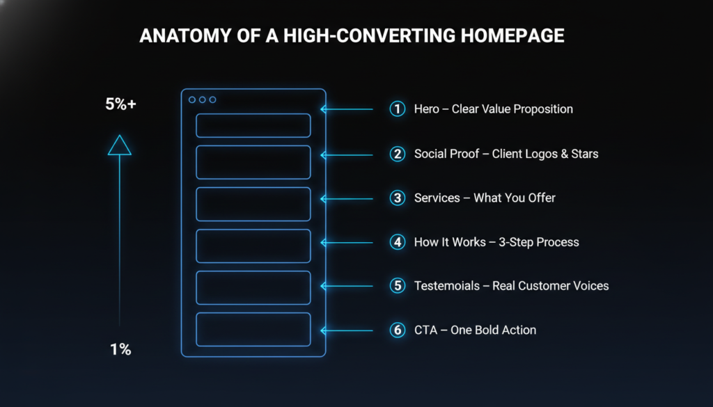
Your homepage is your most important page. For most websites, it receives the most traffic and sets the tone for everything else. The hero section, the area visible before any scrolling, is the most important part of your homepage.
You have roughly five seconds to answer three questions in a visitor’s mind:
If your hero section can’t answer all three clearly, you’re losing visitors before they’ve had a chance to become customers.
A clear headline. Your headline is the first thing visitors read. It should communicate your core value proposition in plain language. Not your company slogan. Not a mission statement. A direct, benefit-focused statement that tells visitors what you do and why it matters to them.
Weak: “Innovating for Tomorrow’s Digital Landscape” Strong: “Custom Website Design That Turns Visitors Into Customers”
A supporting subheadline. One or two sentences that add context to your headline. Who do you serve? What’s your key differentiator? What outcome do you deliver?
A primary CTA. One clear call to action above the fold. Not three. Not five. One. Make it specific and action-oriented- “Get a Free Quote,” “Book a Discovery Call,” “Start Your Free Trial.”
A visual that supports the message. Hero images, illustrations, or videos should reinforce what you’re saying, not distract from it. A relevant image of your product in use, your team, or a result you’ve delivered is better than generic stock photography.
Social proof near the top. A row of client logos, a star rating, or a short testimonial near the hero section immediately signals credibility to first-time visitors.
After the hero, your homepage should guide visitors deeper into your story. A logical flow might look like:
Not every homepage needs all of these sections. But every section you include should earn its place. If a section doesn’t build trust, communicate value, or move visitors toward conversion, cut it.
A call to action (CTA) is any element that asks a visitor to do something, such as a button, a link, or a form. It’s the bridge between a visitor who’s interested and a visitor who converts.
Most websites treat CTAs as an afterthought. They slap a “Contact Us” button in the header and call it done. That’s a missed opportunity.
Specificity. “Get a Free Website Audit” converts better than “Contact Us.” “Start Your Free 14-Day Trial” converts better than “Sign Up.” The more specific your CTA, the clearer the value, and the lower the perceived risk.
Placement. CTAs should appear at natural decision points, after you’ve made a compelling case, not before. Put a CTA after a strong testimonial. Put one at the end of a service description. Put one after a case study result. And always include one above the fold.
Visual prominence. Your primary CTA button should stand out on the page. Use a color that contrasts with your background and isn’t used for other elements. Make it large enough to notice but not so large that it looks desperate.
Repetition without annoyance. On a long page, repeat your CTA in multiple places. Visitors scroll at different depths. Some convert after reading the hero section. Others need to read three testimonials first. Give them opportunities throughout the page, not just at the top and bottom.
Reduce friction around CTAs. If your CTA leads to a form, keep the form short. If it leads to a checkout, minimize steps. If it triggers a pop-up, make it easy to close. Every bit of friction between the click and the completion is a conversion you risk losing.
A landing page is a standalone page designed for one specific campaign or conversion goal. Unlike your homepage, which serves multiple audiences and purposes, a landing page is laser-focused.
Landing pages are used for paid ad campaigns, email campaigns, specific product or service promotions, and lead magnet downloads. Because they have a single goal and a single audience, they can be optimized far more aggressively than general site pages.
A headline that matches the ad or link that brought the visitor there. If someone clicks an ad that says “Free Website Audit for Small Businesses” and lands on a page that says “Our Services,” they’ll leave immediately. Message match and consistency between your ad and your landing page are critical.
A single, clear CTA. No navigation menu. No links to other pages. No distractions. Just the offer and the action you want the visitor to take.
Benefits over features. Your landing page copy should focus on what the visitor gets, not what your product or service does. “Save 10 hours a week on reporting” beats “automated reporting dashboard.”
A short, specific form. The shorter your form, the higher your conversion rate. Only ask for what you actually need. If all you need is a name and email, don’t ask for phone number, company size, and annual revenue.
Social proof on the page. A testimonial, a review rating, or a recognizable client logo directly on the landing page increases trust and reduces hesitation. No exit routes. Remove the header navigation and footer links from landing pages. Every link is a potential exit. Keep visitors focused on one decision.
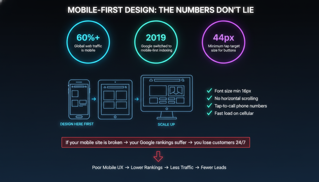
More than 60% of global web traffic now comes from mobile devices. In some industries, such as restaurants, local services, and retail, that number is even higher. If your website doesn’t work well on a phone, you’re failing the majority of your visitors.
This isn’t a new problem. But a surprising number of websites still treat mobile as an afterthought, designing for desktop first and then squeezing things down to fit smaller screens. That approach produces mediocre results at best.
The right approach is the opposite: mobile-first design.
Mobile-first means you design for the smallest screen first, then scale up to larger screens. You start with the constraints of mobile, limited space, touch navigation, and slower connections, and build from there.
This forces better decisions. When you only have 375 pixels of width to work with, you can’t hide behind cluttered layouts or dense columns of text. You have to prioritize ruthlessly. What’s the most important thing on this page? That goes first. Everything else earns its place.
The result is a site that works beautifully on mobile and scales gracefully to tablet and desktop, rather than a desktop site that’s been awkwardly compressed.
Responsive design is the technical implementation of mobile-first thinking. A responsive website uses flexible layouts, fluid grids, and CSS media queries to automatically adjust its layout based on the screen size of the device being used.
On a desktop, you might show a three-column layout. On a tablet, two columns. On mobile, one column. Images resize proportionally. Font sizes adjust. Navigation collapses into a hamburger menu. The content is the same, the presentation adapts.
A responsive site is not the same as a mobile site. A separate mobile site (a different URL or subdomain for mobile users) is an outdated approach that creates SEO problems, maintenance headaches, and inconsistent user experiences. Responsive design handles everything in one codebase.
Touch targets. Buttons and links need to be large enough to tap accurately with a finger. The minimum recommended size is 44×44 pixels. Small text links placed close together are one of the most common mobile usability failures.
Font sizes. Body text should be at least 16px on mobile. Smaller than that, and users have to pinch and zoom, which they won’t do. They’ll just leave.
No horizontal scrolling. If your page requires horizontal scrolling on mobile, something is broken. Content should fit within the screen width at all times.
Fast load times on mobile connections. Mobile users are often on cellular connections, which are slower than home broadband. Heavy images, render-blocking scripts, and unoptimized code hit mobile users hardest.
Tap-to-call. For service businesses, especially, your phone number should be a tappable link on mobile. One tap to call is a genuine conversion opportunity. A number that has to be manually dialed is friction.
Forms on mobile. Keep mobile forms as short as possible. Use the correct input types, number keyboards for phone fields, and email keyboards for email fields, so users don’t have to switch keyboards manually.
Since 2019, Google has used the mobile version of your site as the primary version for indexing and ranking. That means if your mobile site is missing content, loads slowly, or has a poor user experience, your search rankings suffer, regardless of how good your desktop site is.
Mobile performance is no longer just a UX concern. It directly affects your visibility in search.
Read More:
Mobile-First Responsive Web Design
Most people think of SEO as a content and keyword problem. Write the right articles, target the right terms, and build some backlinks. But design plays a massive role in how well your site ranks, and most of it happens before a single word of content is written.
SEO and web design are not separate disciplines. They’re deeply intertwined, and a site that ignores design’s impact on SEO will always underperform in search, no matter how good the content is.
Search engines discover and index your content by crawling your site, following links from page to page. If your site structure is disorganized, important pages are buried deep in the navigation, or your internal linking is poor, crawlers will miss content and your rankings will suffer.
A clean, logical site structure helps both users and search engines. Main categories should be accessible within one or two clicks from the homepage. Every important page should be linked from somewhere in your navigation or content. Orphaned pages, pages with no internal links pointing to them, are effectively invisible to search engines.
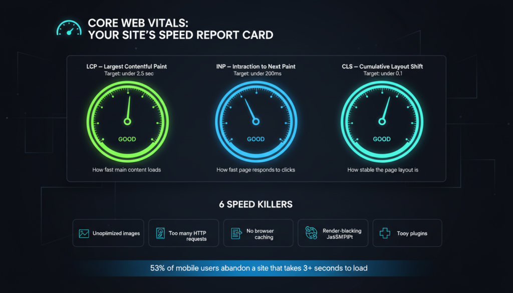
Google officially uses page speed as a ranking signal and has done so for years. Slow sites rank lower. They also convert worse. The relationship between speed and performance is well established.
Google measures speed through a set of metrics called Core Web Vitals:
These are design and development decisions, not content decisions. Image optimization, lazy loading, clean code, efficient hosting, and a well-structured CSS and JavaScript setup all affect these scores directly.
URLs should be clean, descriptive, and consistent. A URL like yoursite.com/services/web-design is better than yoursite.com/page?id=47. Descriptive URLs help search engines understand what a page is about and make links more clickable in search results.
Your page headings, H1, H2, and H3, create a content hierarchy that both users and search engines use to understand your page. Every page should have exactly one H1, the main topic of the page. Subheadings should use H2 and H3 in a logical, nested structure. Don’t choose heading levels based on how they look. Use them based on their meaning, and handle visual styling with CSS.
Images are often the largest files on a webpage and the biggest contributor to slow load times. Every image should be:
Schema markup is structured data added to your HTML that helps search engines understand your content better. It can enable rich results in Google, star ratings, FAQs, business hours, and more, directly in the search results page. These enhanced listings get significantly higher click-through rates than standard results.
For local businesses, schema markup for business name, address, phone number, and operating hours is particularly valuable.
As covered in the previous section, Google indexes the mobile version of your site first. A poor mobile experience directly hurts your rankings. Mobile-first design is an SEO strategy, not just a UX strategy.
Read More:
SEO-Optimized Web Design Lafayette
Speed is not a nice-to-have. It’s a fundamental requirement of modern web design.
The numbers are stark. According to research, 53% of mobile users abandon a site that takes longer than three seconds to load. A one-second delay in page load time can reduce conversions by 7%. The faster your site, the more visitors stay, engage, and convert.
Speed also directly affects how your site feels. A fast site feels professional and trustworthy. A slow site, regardless of how good it looks when it finally loads, creates immediate doubt.
Understanding the causes of slow load times helps you address them at the source.
Unoptimized images are the most common culprit. A single uncompressed hero image can be 5–10MB. Multiply that across a page with multiple images, and you have a serious problem. Every image on your site should be compressed, correctly sized, and served in a modern format.
Too many HTTP requests. Every element on a page, including images, scripts, stylesheets, and fonts, requires a separate HTTP request. Pages with dozens of external resources load significantly slower. Combining files, using CSS sprites, and eliminating unnecessary resources reduces request count.
Render-blocking JavaScript and CSS. When a browser loads a page, it reads HTML from top to bottom. If it encounters a large JavaScript file early in the code, it stops rendering the page until that file is fully loaded. Moving scripts to the bottom of the page or loading them asynchronously prevents this bottleneck.
No caching. Browser caching stores certain files locally on a visitor’s device so they don’t need to be re-downloaded on return visits. Without caching, every visit to your site requires a full reload of every resource. Proper cache headers dramatically speed up repeat visits.
Cheap or shared hosting. Your hosting environment has a significant impact on server response time. Shared hosting, where your site shares server resources with hundreds of other sites, is often the hidden reason behind slow server response times. A good hosting provider with a content delivery network (CDN) makes a measurable difference.
Too many plugins or third-party scripts. Every analytics tool, chat widget, marketing pixel, and social sharing button you add to your site adds weight. Audit your third-party scripts regularly and remove anything you’re not actively using.
Google’s PageSpeed Insights is the standard tool. It scores your site on both mobile and desktop, identifies specific issues, and tells you what to fix. Aim for a score above 80 on mobile; above 90 is excellent. GTmetrix and WebPageTest are also useful for more detailed analysis.
Run speed tests from multiple locations and on multiple devices. A site that loads fast on your office broadband connection might load slowly on a mobile connection in a different city.
Design trends exist for a reason. They reflect how user expectations evolve, how technology improves, and how visual culture shifts. Staying aware of trends helps you build sites that feel current and credible, not outdated.
But not every trend is worth chasing. Some are genuinely improving how websites work. Others are aesthetic fads that fade quickly and date your site badly. The goal is to adopt trends that serve your users and your business goals, and ignore the ones that are just noise.
Here are the trends that are currently shaping effective web design.
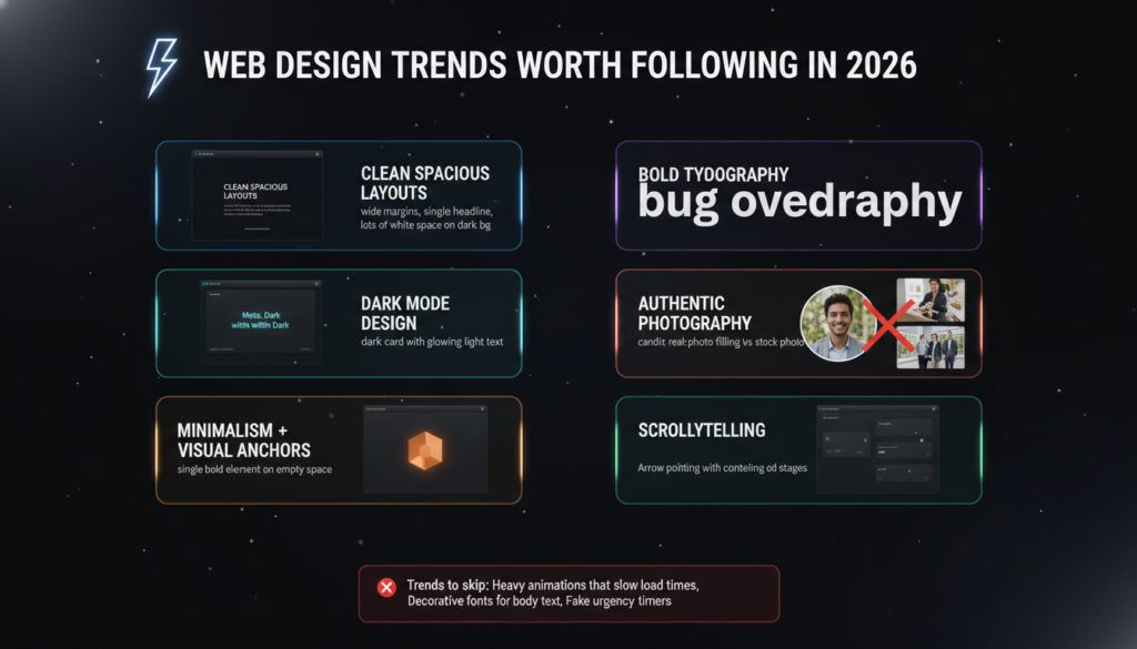
The era of information-dense, cluttered web pages is over. Modern web design favors generous white space, focused content, and breathing room around every element. This isn’t laziness, it’s a deliberate choice that makes content easier to process, more premium in feel, and more focused on what matters.
Visitors today are overwhelmed with information everywhere they look. A website that gives their eyes room to rest and their attention a clear direction stands out immediately.
Typography has moved beyond its role as just a way to display text. Large, expressive headlines, sometimes filling the full width of the screen, are being used as primary visual elements. Strong typographic choices can carry an entire page without relying on photography or illustration.
This trend works because it forces clarity. When your headline is the main visual, it has to say something worth reading.
Dark backgrounds with light text have become a mainstream design option, not just a developer preference. Dark mode feels premium, reduces eye strain in low-light environments, and makes color accents pop with much higher visual impact.
It works particularly well for technology companies, creative agencies, and luxury brands. It’s not the right choice for every business; a children’s education site or a family-friendly restaurant probably shouldn’t go dark, but when it fits the brand, it can be highly effective.
Generic stock photography is increasingly recognized, and distrusted, by website visitors. Real photos of your team, your workspace, your products, and your actual customers perform better in almost every context. They build trust that polished but obviously staged stock images simply can’t.
If budget allows, investing in professional brand photography is one of the highest-value things you can do for your website. Real visuals make real connections.
Minimalist design doesn’t mean boring. The most effective minimalist sites strip away everything unnecessary, and then let one or two strong visual elements carry the page. A single striking image. A bold color block. A full-screen video. Minimalism creates contrast, and contrast creates impact.
The risk with minimalism is going too far, removing so much that the page feels empty and uninspiring. The balance is intentional restraint, not accidental emptiness.
Rather than presenting all information at once, scrollytelling reveals content progressively as the user scrolls. Sections animate in, stories unfold, and data visualizes in real time. When done well, it creates an engaging, almost cinematic experience that keeps visitors scrolling and absorbing information naturally.
This approach works best for brand storytelling, product launches, and case studies. It’s less appropriate for pages where users need to scan, like pricing pages or contact pages.
Read More:
Animation in web design has a complicated reputation. Done well, it elevates the user experience, guides attention, and makes a site feel alive. Done badly, it’s distracting, slow, and annoying.
The key is purpose. Every animation on your site should exist for a reason- to guide the user, to provide feedback, to create delight, or to tell a story. If an animation doesn’t serve one of those purposes, it doesn’t belong.
Scroll-triggered animations activate as users scroll down the page. Elements fade in, slide up, or scale into view. When subtle, these animations make a page feel dynamic and well-crafted. They also serve a functional purpose, drawing attention to content as it enters the viewport and creating a sense of progression through the page.
The keyword is subtle. Elements that aggressively fly in from multiple directions simultaneously are exhausting. A gentle fade-up on scroll is all most content needs.
Hover effects provide visual feedback when users move their cursor over interactive elements, links, buttons, cards, and images. A button that slightly changes color or shifts on hover confirms to the user that it’s clickable. A card that lifts with a soft shadow on hover adds tactile quality to the interaction.
These micro-level animations make interfaces feel responsive and polished. They’re small, but they add up to a noticeably higher quality experience.
Loading animations fill the gap while content is being fetched. A well-designed loading state, a skeleton screen, a progress bar, and a simple spinner keep users from experiencing a jarring blank screen. It signals that something is happening and reduces perceived wait time.
Page transitions animate the change between pages or sections. A smooth fade between pages feels more cohesive than an abrupt jump. Used carefully, page transitions make a site feel like an application rather than a collection of static documents.
Parallax scrolling moves background elements at a different speed than foreground content as the user scrolls, creating a sense of depth. It’s visually impressive when used sparingly as an accent, and overwhelming when applied to the entire page.
Microinteractions are the small, functional animations that respond to specific user actions. They’re the details that most visitors never consciously notice, but would immediately miss if they were gone.
Examples of effective microinteractions:
Each of these does something specific: it confirms that an action was registered, tells the user what’s happening, or provides feedback about the system state. They reduce uncertainty, and uncertainty is a conversion killer.
Animations that cause lag or jank are worse than no animation at all. On lower-end devices and slower connections, heavy animations can make a site feel broken.
Best practices for performant animation:
Respect the prefers-reduced-motion media query. Some users, particularly those with vestibular disorders, experience nausea from motion on screen. If this setting is active on their device, your animations should be reduced or disabled entirely.
Your website is the most powerful brand asset you have. It’s where your brand lives in its most complete, controlled form, where you decide exactly how you look, what you say, and how you make people feel.
Most businesses understand branding as a logo and a color palette. But brand expression on a website goes much deeper than that.
Every visual decision on your website communicates something about your brand. Your typography says something. Your color choices say something. The photography style you choose says something. The language you use, the amount of white space you allow, the way you lay out your homepage, all of it creates an impression.
Brand integration means these decisions are consistent, intentional, and aligned with how you want your business to be perceived. It means your website feels like an extension of your brand identity, not a generic template with your logo dropped in.
A financial services company that wants to project stability and expertise should use a restrained color palette, traditional serif typography, and professional photography. A creative agency that wants to project innovation and energy might use bold colors, experimental layouts, and dynamic animations. Neither approach is wrong, but applying the wrong one to the wrong brand is.
Your font choices are a brand decision, not just a readability decision. A law firm using a clean, authoritative serif font communicates something very different from a tech startup using a geometric sans-serif. A wellness brand using a soft, hand-crafted typeface communicates something different still.
When choosing fonts, think about what personality they project, and whether that personality matches your brand. Then make sure you use those fonts consistently across every page, every touchpoint, every asset.
Your brand color palette should be defined and applied consistently across your entire site. Primary brand colors for key elements, headlines, CTAs, and accents. Secondary colors for supporting elements. A neutral base for backgrounds and body text.
Consistency matters enormously here. When your button is blue on one page and green on another, it erodes trust in subtle ways. When your color palette is applied with discipline, your brand feels cohesive and professional.
The most memorable websites don’t just present information; they tell a story. They take visitors on a journey that builds understanding, creates emotional connection, and leads naturally toward a decision.
Good web storytelling isn’t about writing a novel on your homepage. It’s about structuring your content so that each section builds on the last. It starts with a problem or tension that the visitor relates to. It introduces a solution. It builds credibility through proof. It resolves with a clear, compelling call to action.
The design supports this narrative arc. Visual contrast between sections creates rhythm. Imagery reinforces emotional beats. Typography shifts in scale to signal transitions between ideas.
When design and storytelling work together, a website becomes more than a business card. It becomes a persuasive experience that moves people.
Brand storytelling isn’t just visual. The words on your site, the headlines, the body copy, the button labels, the error messages, all have a voice. That voice should be consistent with your brand personality and consistent throughout the site.
A brand that’s warm and conversational shouldn’t have a formal, corporate pricing page. A brand that positions itself as an expert authority shouldn’t have a homepage full of casual slang. Define your brand voice clearly, and apply it everywhere.
As websites grow, they get messy. New pages get added. Different designers work on different sections. Buttons end up in five slightly different shades of blue. Heading sizes become inconsistent. Spacing varies randomly between sections. What started as a clean, cohesive design gradually becomes a patchwork of inconsistencies.
A design system prevents this from happening and fixes it when it already has.
A design system is a collection of reusable components, standards, and guidelines that define how your website looks and behaves. It’s the single source of truth for every design decision, colors, typography, spacing, buttons, forms, icons, layouts, and more.
Think of it as a rulebook and a component library in one. When every designer, developer, and content editor follows the same system, your site stays consistent no matter how much it grows or how many people work on it.
Design systems range in complexity from a simple style guide document to a full component library with documented code. The right level of complexity depends on your team size and the scale of your website. A five-page business site doesn’t need the same system as a 500-page enterprise platform. But every website, regardless of size, benefits from having at least the foundational elements documented.
Your design system starts with a defined, finite set of colors. Not infinite variations, a specific, named set that covers every use case.
A well-structured color palette typically includes:
Every color should have a name and a defined use. “Use the primary brand color for CTA buttons, active navigation states, and key highlights. Never use it for body text.” That kind of specificity eliminates guesswork and prevents inconsistency.
Your typography system defines every text style used across the site. This includes heading levels (H1 through H6), body text, captions, labels, button text, and any other text variants you need.
For each style, the system specifies: font family, font weight, font size, line height, letter spacing, and any other relevant properties. A well-defined typography scale creates natural visual hierarchy across every page, without anyone having to make those decisions from scratch each time.
Inconsistent spacing is one of the most common and most noticeable signs of a poorly maintained website. Sections that are too close together on one page, too far apart on another. Padding inside cards varies randomly. Margins that don’t align across different page types.
A spacing system solves this by defining a fixed set of spacing values used throughout the site. Most systems use a base unit, commonly 4px or 8px, and build a scale from there: 4, 8, 12, 16, 24, 32, 48, 64, 96px. Designers and developers only use values from this scale. The result is spatial consistency that makes the entire site feel more organized and intentional.
This is where the real value of a design system lives. A component library is a collection of pre-built, reusable UI elements, the building blocks of your website.
Common components include:
Each component is designed once, documented clearly, and then reused across the site. When you need to update a component, changing the button border radius, for example, you update it once in the system, and it propagates everywhere.
This saves enormous amounts of time. It also ensures that every instance of a component looks and behaves identically, no matter where it appears on the site.
Your design system should specify which icon set you use and how icons should be sized and colored. It should also define your photography style. Are you using bright, natural lifestyle photography? Dark, moody editorial images? Flat illustrations? Clean product shots on white backgrounds?
Mixing multiple photography styles across a website creates visual inconsistency that undermines brand perception. Your imagery guidelines keep everything coherent.
If your site uses animation, your design system should document it. What easing curves do you use? What are the standard durations for transitions? Which interactions get animation and which don’t? Consistent animation behavior makes a site feel polished and intentional rather than arbitrary.
Consistency is not just a design preference. It directly affects how users perceive and trust your brand, and how efficiently your team can build and maintain your site.
When every page of your website looks and feels like part of the same family, it signals professionalism and attention to detail. Visitors may not consciously notice consistency, but they absolutely notice inconsistency. A button that looks different on two pages. A heading that’s a different size in one section. A color that appears slightly off from the brand palette.
These discrepancies create subtle doubt. If the details aren’t right, what else isn’t right? Trust is built in small increments and eroded the same way.
When your site is consistent, users learn how it works quickly. They know what buttons look like. They know where the navigation is. They know what a clickable element looks like versus a decorative one. Once they’ve learned your interface conventions on one page, every other page is immediately familiar.
Inconsistent design forces users to relearn your interface on every page. That extra cognitive effort accumulates and contributes to a feeling of confusion and frustration that visitors can’t always articulate but absolutely feel.
For your team, a design system with a component library dramatically accelerates how fast new pages and features get built. Instead of designing every element from scratch, designers pull from the library. Instead of writing new CSS for every component, developers reference existing styles.
This also reduces errors. When everyone is pulling from the same system, there’s less opportunity for one-off decisions that break the visual language of the site.
When your design system is documented and your components are clearly defined, making site-wide changes is straightforward. Updating your brand colors? Change them in one place, and they propagate everywhere. Refining your button style? Update the component once. Without a system, these changes require hunting through every page manually, a process that’s slow, expensive, and almost always incomplete.
You don’t need to build a full design system before you launch your first page. But you should document the basics from day one:
Start with your color palette, your typography scale, and your core components, buttons, forms, and navigation at a minimum. Keep it in a shared document or design file that everyone on your team can access. Add to it as your site grows.
The cost of establishing these foundations early is small. The cost of not having them and trying to retrofit consistency into a sprawling, inconsistent site later is high.
At some point, almost every business faces the same question: our website isn’t working anymore. Do we redesign it, or do we start fresh?
It sounds like a simple question. It rarely is. The right answer depends on what’s actually wrong with your current site, and what you’re trying to achieve.
A redesign means keeping your existing site’s foundation, often its CMS, URL structure, and core content, and rebuilding the design layer on top of it. You’re updating how it looks and feels without necessarily rebuilding how it works underneath.
Redesign is the right choice when:
A redesign is generally faster and less expensive than a full rebuild. It carries less risk to your existing SEO rankings because your URL structure stays intact. And it’s less disruptive to your team because the underlying systems don’t change.
Starting from scratch is the right call when your current site’s problems go deeper than the surface.
Build new when:
New builds give you a clean slate. You’re not constrained by decisions that were made years ago for a different version of your business. Everything is intentional from the ground up.
The tradeoff is cost, time, and SEO risk. A new site means new URLs, and if redirects aren’t handled carefully, you can lose significant search ranking equity built up over the years.
Many projects fall somewhere in between. You keep the CMS and core content architecture, but rebuild the design system and key pages from scratch. Or you redesign most of the site but rebuild specific sections, like the blog or eCommerce functionality, on better technology.
The right approach is determined by an honest audit of what’s working and what isn’t. Don’t rebuild things that work. Don’t preserve things that are fundamentally broken.
Not sure whether you need a redesign or a new site? Talk to our team — we’ll help you figure it out.
Read More:
Whether you’re doing a full redesign or a targeted refresh, a structured process prevents the most common and costly mistakes. Here’s what a thorough redesign process looks like from start to finish.
The first step in any redesign is understanding what you’re working with and where you’re going.
Audit your current site thoroughly. What pages exist? Which gets traffic? Which converts? Which are outdated or irrelevant? Use Google Analytics and Google Search Console to understand which pages drive value; these need to be preserved and redirected carefully. Which pages have high traffic but low engagement? These are redesign priorities.
Document your current SEO performance. Before touching anything, record your current keyword rankings, organic traffic, and top-performing pages. This is your baseline. If traffic drops significantly after launch, you need this data to diagnose why.
Identify what’s not working. Be specific. Is the bounce rate high because the design is poor, the content is weak, or the page loads slowly? Are conversions low because the CTA is buried, the trust signals are insufficient, or the form is too long? Design solutions require problem clarity.
Define your goals for the new site. What does success look like? More leads? Better conversion rate? Improved mobile experience? Higher search rankings? Specific goals lead to specific design decisions. “Make it look better” is not a goal.
Understand your audience better than before. Has your target customer changed? What are their biggest questions and concerns? What do they need to see before they trust you? Customer research, even informal interviews or surveys, is invaluable input for a redesign.
Preserve your URL structure where possible. If you must change URLs, create 301 redirects from every old URL to its new equivalent. Missing redirects mean lost SEO equity and broken links from external sources.
Migrate content carefully. Don’t just copy and paste. Review every piece of content as you migrate it. Is it still accurate? Still relevant? Does it reflect your current brand voice? A redesign is the perfect opportunity to improve your content, not just move it.
Design mobile-first. As covered earlier, start with mobile and scale up.
Test every conversion path. Every form, every CTA, every checkout flow. Test them yourself on multiple devices and browsers. Then have someone who didn’t build the site test them. Fresh eyes catch problems that familiarity hides.
Check every internal link. Broken internal links are both an SEO problem and a user experience problem. After migrating, crawl the site with a tool like Screaming Frog to identify and fix broken links.
Set up proper analytics before launch. Make sure Google Analytics, Google Search Console, and any other tracking you use are configured correctly on the new site before it goes live. You need data from day one.
Launch day is not the end of the project.
Monitor rankings closely for the first four to eight weeks. Some fluctuation is normal after a redesign. Significant drops, especially on pages that had strong rankings, indicate a problem: missing redirects, content changes that hurt relevance, or technical issues affecting crawlability.
Watch your analytics for behavioral changes. Are users engaging with the new design as expected? Where are they dropping off? Are conversion rates improving or declining? Real user data tells you what your testing couldn’t predict.
Gather user feedback. Tools like Hotjar or Microsoft Clarity show you session recordings and heatmaps, where users click, how far they scroll, and where they get stuck. This behavioral data is invaluable for post-launch optimization.
Iterate based on data. A redesign is not a one-time event. The best sites are continuously improved based on what the data shows. Set a regular cadence for reviewing performance and making improvements.
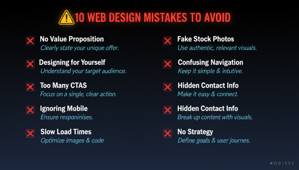
Most web design failures are predictable. The same mistakes appear over and over across different businesses, different industries, and different budgets. Knowing what they are is the first step to avoiding them.
The single most common and most damaging mistake on any website. If visitors can’t understand what you do, who you serve, and why you’re the right choice within five seconds of landing on your homepage, you’ve lost them. Your value proposition needs to be the first thing they see, written in clear, specific language, not marketing jargon.
Business owners and internal teams naturally want to talk about what they care about- the company history, the awards, and the proprietary process. Visitors care about one thing: what’s in it for them. Every page, every section, every headline should be written and designed from the visitor’s perspective, not the business owner’s.
When everything is a priority, nothing is. A page with eight different CTAs, “Download our guide,” “Book a call,” “Follow us on Instagram,” “Read our blog,” “Get a quote,” “Sign up for our newsletter”, paralyzes visitors with choice. Every page should have one primary CTA. Secondary options can exist, but should be visually subordinate.
Still, in 2024, businesses launch websites that are broken on mobile. Small text, overlapping elements, buttons too small to tap, and forms that are unusable on a phone screen. Given that the majority of web traffic is mobile, this is not a minor oversight; it’s a fundamental failure.
Unoptimized images, bloated code, too many plugins, cheap hosting. Any one of these can make a site unacceptably slow. All of them together create a site that most visitors never actually see, because they’ve already left before it finishes loading.
A smiling call center worker with a headset. A diverse group of professionals in a boardroom looking at a laptop and laughing. Visitors recognize these images immediately, and they do the opposite of what you intend; instead of building trust, they signal inauthenticity. Use real photos wherever possible. If you must use stock, choose images that look natural and human rather than posed and corporate.
Confusing navigation is one of the fastest ways to lose visitors. Vague menu labels, too many options, dropdown menus that are hard to use on mobile, and important pages buried three levels deep. Navigation should be so obvious that users never have to think about it.
For any business that wants inquiries, your phone number, email, and location should be easy to find from any page. A contact page buried in the footer that requires three clicks to find is a conversion killer. Your phone number belongs in the header. Your contact CTA belongs on every page.
Long paragraphs with no breaks, no subheadings, no visual variation. Users don’t read websites like books; they scan. If your content isn’t structured for scanning, with clear headings, short paragraphs, and visual anchors, most of it will never be read.
Perhaps the most expensive mistake of all: spending significant time and money on a website without first defining who it’s for, what it needs to achieve, and how success will be measured. A beautiful website built without a strategy is a beautiful website that doesn’t perform. Strategy comes before design, every time.
You’ve just covered everything that goes into building a website that actually works.
Not just a site that looks good, but one that loads fast, earns trust, guides visitors toward action, ranks in search, works flawlessly on every device, and grows with your business.
Let’s bring it all together.
Great web design starts with strategy. Before a single wireframe is sketched or a color is chosen, you need clarity on who your audience is, what they need, and what you want them to do. Every design decision flows from that foundation.
Fundamentals never go out of style. Color, typography, spacing, visual hierarchy, and UX principles aren’t trends. They’re the bedrock of every effective website, regardless of industry or budget. Get these right, and everything built on top of them is stronger.
Design for your specific business context. A SaaS company and a local restaurant have fundamentally different audiences, goals, and conversion paths. Cookie-cutter design produces cookie-cutter results. Your website should be built around your business, not adapted from a template built for someone else.
Conversion is the point. A website that doesn’t convert is a cost, not an asset. Every page should have a purpose. Every layout decision should serve that purpose. Trust signals, clear CTAs, frictionless user journeys, and honest social proof are what turn traffic into revenue.
Technical performance is non-negotiable. Mobile-first design, fast load times, SEO-optimized structure, and accessible markup are not optional add-ons. They are the baseline requirements of a competitive website in 2024 and beyond. Neglect them, and no amount of visual polish will compensate.
Consistency builds credibility. A design system isn’t bureaucracy; it’s the infrastructure that keeps your brand coherent as your site grows. Consistent color, typography, spacing, and components signal professionalism at every touchpoint.
A website is never truly finished. The businesses with the best-performing websites treat them as living assets, continuously improved based on data, user behavior, and changing business needs. Launch is the beginning of the work, not the end.
If you’ve read this far, you’re serious about getting your website right. Here’s how to move forward depending on where you are right now.
If you don’t have a website yet, start with a strategy. Define your audience, your goals, and your conversion paths before you talk to any designer or developer. The clearer your brief, the better your outcome.
If you have a website that isn’t performing, audit it honestly. Use the frameworks in this guide to identify exactly what’s broken. Is it a design problem, a UX problem, a technical problem, or a strategy problem? The fix depends entirely on the diagnosis.
If you’re planning a redesign, use the redesign checklist in Part 9. Protect your SEO equity, define clear goals, and don’t skip the discovery and strategy phase just because you already have a site to reference.
If you’re trying to improve conversions on an existing site, start with your homepage hero section and your primary CTAs. These two elements have more impact on conversion rate than almost anything else. Small, focused improvements here compound quickly.
If you’re building for a specific industry, go back to Part 3 and use the industry-specific guidance as a lens for every other decision in this guide. The principles are universal. The application is specific.
Building a great website is not a small undertaking. But it’s one of the most valuable investments your business can make. Done right, your website works for you around the clock, generating leads, building trust, and converting visitors into customers without requiring your direct involvement.
The businesses that treat their website as a strategic asset, not just a digital necessity, are the ones that pull ahead. Everything you need to build that kind of website is in this guide.
Now go build something worth visiting.
Ready to turn this guide into action? Talk to our web design team about building a website that performs, not just one that looks good.