Home / Blog Details
Take your digital marketing to the next level with data-driven strategies and innovative solutions. Let’s create something amazing together!

From Google search results to AI chatbots, we optimize your website so customers can find you faster — and choose you over competitors.
A strong homepage must include a clear value proposition, a primary call-to-action, trust signals, easy contact information, and a mobile-friendly layout. It should present your core services, showcase customer reviews, answer common questions, and guide visitors toward becoming leads. Every section must work together to build trust and prompt action within the first few seconds of a visit.
Key Takeaways
Most small business homepages are leaking leads every single day, not because they look bad, but because they are missing the elements that turn visitors into customers. If you have ever wondered why your website gets traffic but your phone does not ring, the answer is almost always on your homepage.
A homepage is not a brochure. It is a 24/7 salesperson. In over a decade of designing and optimizing websites for local service businesses across Lafayette, LA, and the surrounding Acadiana area, our team at Sites N Apps has seen the same pattern repeatedly. Businesses that include the right homepage elements get consistent leads. Those who skip them struggle, no matter how good their service actually is.
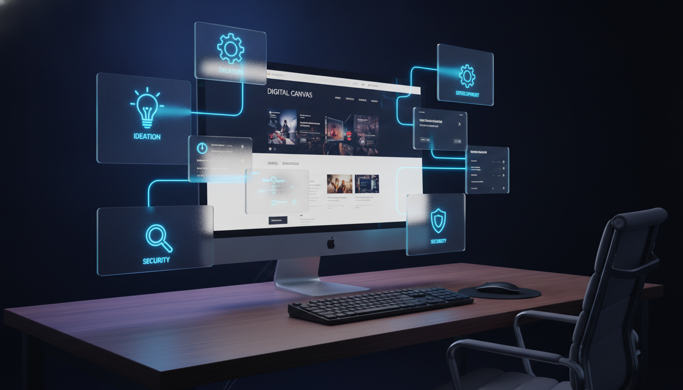
This guide covers every element your homepage needs in 2026: the structure, the copy, the trust signals, the local SEO components, and the conversion tools. By the end, you will have a clear picture of exactly what your homepage should include and a checklist to audit what is already there.
Your homepage is the single page on your entire website that nearly every visitor will see. Whether they land on a blog post, a service page, or find you through a Google Business Profile, a large percentage will click through to your homepage before making a decision. According to research from Nielsen Norman Group, users form an opinion about a website in as little as 0.05 seconds (Source: Nielsen Norman Group). That is faster than a blink.
Within the first 8 seconds, a visitor is deciding three things. First, do you offer what they need? Second, can they trust you? Third, is it easy to take the next step? If your homepage does not answer all three quickly, visitors leave. They do not come back.
Think about it this way. You are an HVAC company in Lafayette. A homeowner’s AC unit just died in July. They land on your homepage. If they cannot immediately see that you service their area, that you are available now, and that real customers trust you, they will call your competitor. The decision happens that fast.
A well-structured homepage directly drives phone calls, form submissions, and booked appointments. According to HubSpot’s 2024 marketing report, businesses that include a clear call-to-action on their homepage see an average 121% increase in click-through rates compared to pages without one (Source: HubSpot, 2024). That is not a marginal improvement. That is the difference between a busy month and a slow one.
The bottom line is this: your homepage design choices, what you include, where you place it, and how you say it, are directly tied to how many customers contact you. This is not about aesthetics. It is about function. And the right website design decisions make that function happen.
Key Takeaways
Value proposition: a one or two-sentence statement that tells visitors exactly what you do, who you help, and what sets you apart.
Your value proposition should appear in your homepage headline. It should not be vague. ‘We are the best HVAC company around’ tells visitors nothing useful. ‘Same-day AC repair in Lafayette, LA with 5-star service since 2005’ tells them everything they need to decide to call.
Craft your value proposition around the visitor’s problem. Focus on the outcome they want, not on the features you offer. If your competitor’s headline is generic and yours is specific, you win the click.
Call-to-action (CTA): a button, link, or prompt that tells a visitor what to do next, such as ‘Call Now,’ ‘Get a Free Quote,’ or ‘Book an Appointment.’ Without a CTA, visitors have no clear next step. They read your page and leave.
Your primary CTA should be above the fold. That means visible before any scrolling. Use action language that matches what the visitor wants: ‘Get My Free Estimate’ outperforms ‘Submit’ every time. Use a contrasting color that stands out from your background.
Trust signals are any element that reduces a visitor’s doubt about doing business with you. These include customer reviews, star ratings, industry certifications, years in business, and recognizable client logos.
For local service businesses, Google reviews carry enormous weight. A visible star rating widget directly on your homepage shows new visitors that real people have trusted you before. That one element alone can move a hesitant visitor to pick up the phone.
Your phone number should be in your header, your hero section, and your footer at a minimum. For local service businesses, a click-to-call button on mobile is not optional. According to Google, 61% of mobile searchers call a business directly from search results (Source: Google Think Insights). Make that call as easy as possible.
Mobile-friendly navigation uses a hamburger menu or simplified tab structure that works on a 4-inch screen. Links should be large enough to tap without zooming. The menu should include only your most important pages. A cluttered mobile menu increases bounce rates and frustrates users.
The essential homepage elements above are the floor, not the ceiling. The next section shows you how to build the full structure that turns those elements into a lead-generating machine.
Key Takeaways
The above-the-fold section is everything visible on screen before a visitor scrolls. It is the highest-value real estate on your entire website. Here is what it must contain:
Your headline is the first text a visitor reads. It should include your primary value proposition and ideally mention your location or specialty. Keep it under 12 words. Make it specific. For example: ‘Trusted AC Repair in Lafayette, LA Since 2001.’
One or two sentences below your headline that reinforce what you do and why you are the right choice. This is where you can add a secondary benefit, such as a warranty, a free estimate offer, or a fast response time.
Place your primary CTA button here, directly visible. Alongside it or just below, show a quick trust signal. This could be your Google rating (e.g., ‘4.9 stars on Google’), the number of customers served, or a badge from a professional association.
This section summarizes your core services with short descriptions and links to dedicated service pages. Present services as scannable cards or columns. Use icons or visuals to make it easy to read at a glance.
Do not list every service you offer. Highlight your top 3 to 6. Each card should include the service name, a one-line description, and a link. This section helps visitors quickly identify what they need and move forward.
This section houses your customer testimonials, Google review widget, star ratings, and any certification logos. Place it in the middle third of your homepage, after services. This is the ‘why trust us’ moment in the visitor’s journey.
Use real names and photos where possible. Specific testimonials beat generic ones. ‘They fixed my AC in 2 hours and charged a fair price, highly recommend’ is far more convincing than ‘Great service!’
A short, human summary of who you are, how long you have been in business, and what makes you different. Keep it to 3 to 5 sentences. Include a team photo or owner photo to make it personal. Visitors want to know there is a real person behind the business.
An FAQ section answers the questions your visitors are already typing into Google. It targets Google’s ‘People Also Ask’ box, improves time-on-page, and reduces support calls by answering common concerns before the visitor picks up the phone.
For an HVAC company, FAQ questions might include: ‘How much does AC repair cost in Lafayette?’ or ‘Do you offer same-day service?’ For a dental office, ‘Do you accept Medicaid?’ or ‘How do I book a same-day appointment?’
Your contact section should include a phone number, a contact form, your business address, and your service hours. A Google map embed adds credibility and helps with local SEO. Place this section near the bottom of your homepage, but make the phone number visible throughout the entire page.
Your footer should include your business name, phone number, address, email, service area, and links to key pages, including your privacy policy and any social media profiles. Think of the footer as a second chance to convert a visitor who has scrolled all the way down.
Now that you understand the structure, the next challenge is filling each section with copy that actually converts visitors into leads.
Key Takeaways
A pain-focused headline names the problem your customer is trying to solve. It does not start with your company name. It starts with the visitor’s situation.
For example: ‘AC Stopped Working? Get Same-Day Repair in Lafayette, LA.’ That headline speaks directly to a homeowner in distress. It confirms you are in their city, you are available today, and you fix the exact problem they have.
Compare that to: ‘Welcome to Smith’s HVAC.’ One of these makes a visitor feel understood. The other makes them keep scrolling past you.
Supporting copy appears directly below your headline. It reinforces the promise your headline makes. Use it to add a specific detail: a time guarantee, a price anchor, a free estimate offer, or a certification.
Example: ‘Licensed and insured HVAC technicians serving Lafayette and Acadiana since 2005. Free estimates on all installations. Call us now for same-day service.’ That copy answers the most common objections before the visitor even thinks to raise them.
Feature: what your business has or does. Benefit: what that means for the customer.
Features list: ’10 service vehicles, 3 certified technicians, 24-hour dispatch.’ Benefits: ‘You get faster response times, expert repairs, and help whenever you need it.’ The benefit version speaks to the visitor’s real concern: will this company solve my problem quickly?
Always translate features into benefits in your copy. Ask yourself: ‘So what does this mean for the customer?’ Then write that answer.
Different visitors arrive at your homepage with different needs. A homeowner with a broken AC is in emergency mode. A business owner comparing HVAC companies for a new installation is in research mode.
Your primary headline and CTA should serve the most urgent visitor first, since that is typically the highest-converting segment. Use secondary CTAs and content sections to address visitors who are still comparing options.
With the right words in place, the next step is making sure your services are easy to find and understand.
Key Takeaways
Feature your highest-demand and highest-value services on the homepage. For an HVAC company, that might be AC repair, furnace repair, and AC installation. For a law firm, that might be personal injury, DUI defense, and family law.
Prioritize services that are both profitable and frequently searched. Services that rank well locally and have high call volume should appear in this section.
Use a grid layout with 3 or 6 cards per row. Each card should include a service name (as a heading), a short 1-2 sentence description, and a link or button to learn more. Icons or small images make each card faster to scan.
Avoid paragraph blocks of text for your services section. Paragraphs slow down scanning. Cards and columns communicate service options at a glance, which is how most visitors read on mobile.
Dedicated service pages allow you to go deep on each offering with full details, additional testimonials, FAQ sections, and targeted keywords. They also pass authority between pages through internal linking, which strengthens your overall SEO.
From the homepage, each service card should link directly to its service page. This gives visitors a clear path forward and gives search engines a clear map of your site’s structure.
Showcasing services well sets the foundation. Building trust is what turns interested visitors into customers who actually call.
Key Takeaways
Embed a Google review widget or display 3 to 5 handpicked testimonials in a dedicated section. Use star ratings where possible. Include the reviewer’s first and last name, and the city they are from.
For example: ‘John D., Broussard, LA: They showed up in 2 hours and had my AC running before dinner. Best HVAC company in Acadiana.’ That testimonial is specific, local, and outcome-focused. It works far harder than ‘Great company!’ with no name attached.
Short before-and-after stories show potential customers what is possible. You do not need a formal case study. A 3-sentence summary works: ‘A Lafayette restaurant owner called us with a total AC failure in July. We diagnosed and fixed the system in one visit, saving them from closing for the day.’
These micro case studies work especially well for HVAC, legal, dental, and home services, where the problem and outcome are concrete and relatable.
Display any logos or badges from professional associations, trade certifications, licensing boards, or awards you have received. For HVAC companies in Louisiana, this might include NATE certification or a state contractor license number.
For legal practices, a state bar member badge. For dental offices, an ADA membership logo. These signals tell visitors that a recognized authority has vetted your work.
If you have served recognizable local businesses, institutions, or brands, display their logos (with permission). Even a row of 5 to 8 local business logos communicates scale and community trust that individual testimonials cannot.
A ’20 years in business’ badge is one of the most powerful homepage trust signals for local service businesses. It communicates stability, experience, and community roots. Pair it with a team photo and short bios to make your business feel approachable and real.
Once a visitor trusts you, the next step is giving them a frictionless way to take action.
Key Takeaways
Your primary CTA belongs above the fold. After that, repeat it after the services section, after testimonials, and in the footer. Four placements minimum on a standard homepage is a reasonable target.
Each CTA can use slightly different language to match the context. Above the fold: ‘Get a Free Quote.’ After testimonials: ‘Join 500+ Happy Customers. Call Now.’ These variations keep the CTA feeling fresh rather than repetitive.
Keep your homepage contact form short. Ask for name, phone number, and a brief message or service selection. Every additional field you add reduces submission rates. Three fields are the sweet spot for most local service businesses.
Place the form in its own section near the bottom of the page or in a sticky sidebar if your layout supports it. Make the submit button text specific: ‘Send My Request’ or ‘Get My Free Estimate’ works better than a plain ‘Submit.’
A click-to-call button (a phone number formatted as a tel: link) launches the phone dialer on mobile devices with one tap. For emergency services like HVAC repair, plumbing, or legal assistance, this is the single highest-converting element on your entire mobile homepage.
Make your phone number clickable on mobile. Ensure it is large enough to tap without zooming. Consider making it sticky, so it stays visible as visitors scroll.
An embedded scheduling tool (such as Calendly or Acuity) lets visitors book a time directly without calling. This captures leads during evenings and weekends when your phone may go unanswered.
For dental offices, legal consultations, and service estimates, a scheduling button can dramatically increase the number of appointments booked without any manual follow-up from your team.
Conversion tools get visitors to act. But getting visitors to your page in the first place requires smart navigation.
Key Takeaways
Limit your main navigation to 5 to 7 items maximum. Each item should represent a distinct section that a visitor would logically want to find. Common navigation items for local service businesses include: Home, Services, About, Reviews, and Contact.
Do not include every service in your main navigation. Group services under one menu item with a dropdown. This keeps the top navigation clean and the user experience straightforward.
Prioritize your highest-converting pages. For most local service businesses, this means Services, Contact, and Reviews/Testimonials. Put these in the first half of your menu.
Your blog, career page, or news section can live in the footer or secondary navigation. They add value but are not primary conversion paths.
Dead-end paths occur when a visitor reaches a page that does not offer a clear next step. Every page should include a CTA, a related content link, or a navigation prompt. Never let a visitor hit a wall.
Audit your current navigation by pretending to be a first-time visitor. Click through every path. Ask: Where does this lead? What should I do next? If you cannot answer those questions, neither can your visitor.
On mobile, use a hamburger menu (three stacked lines) that expands into a full-screen or slide-out menu. Make sure all tap targets are at least 44 pixels tall per Apple’s Human Interface Guidelines. Test your menu on both iOS and Android devices.
Sticky navigation (a menu bar that stays at the top as you scroll) works well on desktop and increasingly on mobile. It keeps your CTA and phone number always accessible.
A clean user journey leads visitors where you want them. Paired with local SEO, it also leads Google to rank you there first.
Key Takeaways
NAP stands for Name, Address, and Phone number. It should appear consistently in your website header or footer and match exactly what appears in your Google Business Profile and any online directories.
Beyond NAP, list your service area on the homepage. This could be as simple as: ‘Serving Lafayette, Broussard, Youngsville, Carencro, and surrounding Acadiana communities.’ Google reads this text and uses it to determine your local relevance.
Weave your city and service area into your homepage headings and body copy naturally. For a Lafayette HVAC company, that means writing ‘AC repair Lafayette LA’ or ‘serving Acadiana homeowners since 2005’ rather than purely generic language.
Avoid keyword stuffing. One or two natural mentions in your hero section, a service area list, and a location reference in the footer are usually enough to send clear signals without overloading the page.
An embedded Google Map on your homepage confirms your physical location to both visitors and search engines. For service businesses that operate from a physical address, it adds credibility and signals local relevance.
Even if you are a mobile service business that travels to customers, embed a map showing your general service area. Pair it with your address or a ‘Based in Lafayette, LA’ label.
Local business schema markup: structured data code (JSON-LD format) added to your website that tells search engines your business name, address, phone number, hours, and service type.
Schema markup does not directly move your rankings on its own, but it helps Google understand your business more precisely. This can improve your appearance in local results, voice search, and Google’s AI Overviews. For a complete guide on schema types, see Google’s Local Business structured data documentation.
Local SEO gets you found. Technical performance determines whether your page earns trust once visitors arrive.
Key Takeaways
Core Web Vitals are Google’s performance metrics: Largest Contentful Paint (LCP), Interaction to Next Paint (INP), and Cumulative Layout Shift (CLS). A page that scores well on these metrics ranks higher and retains visitors longer.
Use Google PageSpeed Insights to audit your homepage. Target an LCP under 2.5 seconds. Fix render-blocking scripts by loading JavaScript asynchronously. Minimize unused CSS.
Compress every image before uploading it to your website. Use WebP format for photos. Serve appropriately sized images for mobile versus desktop using srcset attributes.
Oversized, uncompressed images are the most common performance problem on small business websites. A homepage hero image that is 4MB instead of 200KB can add 3 to 5 seconds to your load time. That costs you visitors, before they even see your value proposition.
Open your homepage on your own smartphone. Check these things: Does the text resize correctly? Do buttons work with thumbs? Does the layout stack properly? Is the phone number clickable? Does the menu open and close without issues?
Use Google Search Console’s Mobile Usability report to find mobile errors across your entire site. Fix any reported issues immediately, as these directly affect your mobile rankings.
Accessibility compliance means your website can be used by people with visual, hearing, or motor impairments. At minimum, every image should have descriptive alt text, color contrast should meet WCAG 2.1 AA standards, and all interactive elements should be keyboard-navigable.
Basic accessibility is not just an ethical obligation. It also improves SEO (alt text adds keyword context) and reduces legal risk. The ADA has been applied to websites in multiple court cases, including small business websites.
Once your technical foundation is solid, you can fine-tune your homepage for the local market you actually serve.
Key Takeaways
If your business serves Lafayette and the surrounding Acadiana parishes, name them on your homepage. Include Lafayette, Broussard, Youngsville, Carencro, Scott, Breaux Bridge, and any other areas you cover. Put this in your hero section or just below it.
This is not just good practice for SEO. Local visitors respond to seeing their city mentioned. It confirms immediately that you are a local business, not a national chain. That distinction matters to Acadiana customers who prefer to support local.
Feature reviews from recognizable local neighborhoods or businesses. A testimonial from a Lafayette homeowner reads as more credible to another Lafayette visitor than a generic five-star rating.
If your business sponsors local events, supports charities, or participates in community organizations, mention it briefly in your About section. Community involvement signals roots and reliability in a way that national businesses cannot replicate.
Replace generic CTA language with location-specific alternatives. Instead of ‘Contact Us Today,’ try ‘Call Our Lafayette Team Now’ or ‘Get a Free Estimate in Acadiana.’ These small changes increase CTA relevance for your exact audience.
For Lafayette businesses competing against national brands or larger regional players, locality is your competitive advantage. Use it throughout your homepage language, not just in the footer.
With all these elements in mind, the most practical next step is auditing what your homepage already has and what it is missing.
Use this checklist to evaluate your current homepage or to guide a new build. Work through each category systematically.
A great homepage is not about having the most impressive design. It is about giving the right visitor the right information in the right order, and making it effortless for them to contact you. Every element covered in this guide, from the value proposition and the primary CTA to the trust signals and the local SEO components, works together to convert visitors into leads. When any of these elements are missing, your homepage loses business every single day.
The good news is that most homepage problems are fixable. Once you know what a homepage should include, an audit often reveals just 3 to 5 specific gaps. Closing those gaps can make a measurable difference in how many calls, form submissions, and booked appointments your website generates. The checklist in this guide gives you a concrete starting point.
At Sites N Apps, we have helped dozens of local businesses in Lafayette, Acadiana, and beyond build and redesign homepages that generate consistent leads. Whether you are building your first site or auditing an existing one, we are happy to take a look at your homepage and tell you exactly what it needs. Contact us today to book a free homepage consultation, and let us help you build a website that works as hard as you do.
A small business homepage should be long enough to answer the visitor’s key questions and build enough trust to prompt action, typically between 500 and 1,500 words of visible copy. The exact length depends on your services, your audience’s level of awareness, and how many trust signals you include. Avoid both too-short pages that leave questions unanswered and excessively long pages that bury the call-to-action.
A homepage should include at least 3 to 4 CTA placements: one above the fold, one after the services section, one after testimonials, and one in the footer. For local service businesses with emergency service offerings, a sticky phone number or chat button that stays visible while scrolling can also add significant conversions on mobile.
A blog feed on your homepage is optional. For most small service businesses, it is a lower priority than trust signals, services, and a strong CTA. If you publish consistent, high-quality content, a ‘Recent Articles’ section can add value and show activity. If your blog is sparse or outdated, leave it off the homepage. Stale content reduces credibility.
Review your homepage at a minimum every 6 months. Update testimonials when you have stronger ones. Refresh CTA language to match seasonal promotions. Update certifications, awards, and years in business as they change. Google favors pages that show signs of regular maintenance, so minor updates made consistently keep your page competitive.
The most common mistake is making the homepage about the business instead of about the customer. Headlines that lead with the company name, copy that lists features without explaining benefits, and pages with no clear next step all reflect this mistake. Every element on your homepage should answer the visitor’s implicit question: ‘What does this mean for me, and what should I do next?’
A custom design is not always necessary, but a thoughtfully structured homepage is. Template-based websites can perform well if the structure follows the principles in this guide: clear value proposition, strong CTAs, trust signals, local SEO elements, and fast loading. Where custom design pays off is in differentiation, particularly for businesses in competitive local markets where standing out visually builds additional brand trust.
Struggling to compete for high-search-volume keywords? We help businesses like yours increase visibility, drive more traffic, and dominate competitive search terms—all while keeping your costs low. Our proven strategies focus on long-term growth and measurable results.