Home / Blog Details
Take your digital marketing to the next level with data-driven strategies and innovative solutions. Let’s create something amazing together!
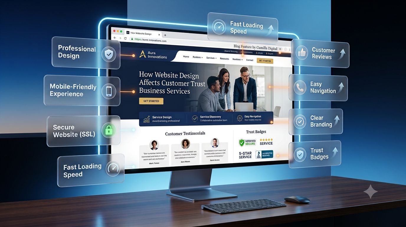

From Google search results to AI chatbots, we optimize your website so customers can find you faster — and choose you over competitors.

UX design is the practice of shaping how easily a visitor can understand your website and complete what they came to do. It covers structure, navigation, page speed, forms, content clarity, and accessibility. When those things work, more of your traffic turns into inquiries. When they do not, visitors arrive, look around, and leave without contacting you.
That gap is what most business owners are really paying to close when they rebuild a website. A site can look modern and still lose customers, because the menu labels are confusing, the contact form asks for too much, or the main action on the page is hard to spot.
This guide explains what UX design is, how it differs from UI design, the fundamental principles behind a site that feels easy to use, and how those principles show up in your traffic and conversion numbers. It is written for business owners and decision-makers, not for design teams.
Key Takeaways
User experience (UX) design is the process of building a website around how real people behave, so a first-time visitor can reach their goal without stopping to figure the site out. A well-designed experience answers three questions in the visitor’s favour.
UX covers the whole journey, not a single screen: the first click from a search result, the service page that explains your offer, the form that captures the inquiry, the message that says what happens next. Each step is a point where someone either continues or quietly leaves.
UX design decides how a website works. UI design decides how it looks. UI is the visual layer: colours, typography, buttons, icons, imagery, and spacing. UX is the layer underneath: what pages exist, how they are grouped, what appears first, where a button belongs and why, and what happens after the click.
Think of UI as the finish on a building and UX as the floor plan. An excellent finish cannot rescue a plan where visitors cannot find the front door. Your business needs both, but the UX decisions come first, because they determine what the interface has to communicate.
Web design is the broader discipline, covering UX, UI, branding, content, and the technical build. This matters when you hire: a project sold as a visual refresh can leave navigation, structure, and forms exactly as they were, so the site looks new while visitors get stuck in the same places.
| Discipline | Question it answers | Typical decisions |
|---|---|---|
| UX design | Can visitors do what they came to do? | Page structure, navigation, user flows, form length, what appears first |
| UI design | Does the interface communicate clearly? | Colour, typography, button styles, icons, spacing, imagery |
| Web design | Does the whole site work as a business asset? | UX and UI plus branding, content, technical build and performance |
Website performance is decided by what visitors can do, not by how the site looks in a screenshot. Every result you care about depends on someone completing a short sequence: understand the offer, find the right page, trust the business, act. UX either clears those steps or blocks them.
The thing doing the blocking is friction. Friction is anything that makes a visitor work harder than they expected. A menu label only your team understands. A page that takes too long to appear. A quote form asking for company size and budget before the visitor knows your prices. A button that says nothing about what happens next. Each is small alone. Together they decide whether a visit ends in a lead or a back button.
Friction moves through your numbers in a predictable order:
Speed is the clearest example, because it has been measured directly. Google and SOASTA research found the probability of a visitor bouncing rises by 32% as page load time moves from one second to three. Confusing navigation reaches the same outcome by a different route. A visitor who cannot locate your pricing behaves exactly like a visitor whose page never finished loading. Both leave, and neither tells you why.
These nine fundamentals are the practical foundation of a website that feels effortless. Each is a decision you can inspect on your own site today, without a design background.
Simplicity means removing anything that does not help a visitor reach their goal. The usual failure is a homepage promoting every service, award, and offer at once, which asks visitors to choose before they understand their options. Many choose nothing. Lead with the one or two actions most visitors need, use white space to separate ideas, and move supporting detail onto its own page.
User-centered design means building around what visitors need rather than what the company prefers internally. The common symptom is a site organised the way the business is organised, using department names or industry jargon as menu labels. Ground the structure in evidence you already own: the questions your sales team answers repeatedly, the emails support receives, and the search terms bringing people to your site.
Information architecture is how content is grouped, labelled, and ordered. Navigation is how visitors move through it. Done well, a visitor can predict where something lives before looking for it. That prediction rests on sensible grouping, with important pages two or three clicks away, and on familiar patterns: the logo top left linking home, main navigation across the top or behind a menu icon on mobile, contact details in the footer. For functional navigation, plain labels such as Pricing or Book a Repair are usually clearer than clever or branded alternatives.
Once a visitor learns how one part of your site behaves, that knowledge should carry everywhere else. Keep buttons, typography, navigation placement, form layouts, icons and error styling consistent across every template. If each checkout step uses the same green Continue button, do not switch the final Complete Order button to red. Visitors read the change as a warning.
Visual hierarchy is the order in which a page tells a visitor what to look at, set by size, weight, contrast, position and spacing. Strong hierarchy makes the most important element obvious within a second. Weak hierarchy makes everything compete, which reads as noise. Quick test: squint at the page until the detail blurs. Whatever still stands out is what your design is emphasising.
Accessibility means people with visual, motor, hearing, or cognitive differences can use your website. Treat it as part of usability rather than a separate compliance task. The Web Content Accessibility Guidelines (WCAG), published by the W3C, are the standard to work against:
Mobile accounts for a significant share of web traffic, and for many consumer-facing business websites it is the primary way visitors arrive. Check your GA4 device report before deciding how much weight to give it. Mobile-first means designing the small screen first and expanding upward, rather than shrinking a desktop layout. In practice: tap targets large enough to hit accurately, text readable without zooming, no horizontal scrolling, and calling or directions available without hunting. Test on real devices.
Visitors need to know what is happening and what to do next. Feedback provides it: loading indicators, a success message confirming the form arrived, visible hover and focus states, and validation that flags a problem as it happens. Error prevention goes one step earlier. Offer a selectable list instead of free text, show format requirements before submission, confirm actions that cannot be undone, and keep whatever the visitor has already typed.
UX is settled by behaviour, not by opinion. Treat launch as a starting point: watch what real visitors do, change one thing at a time, then measure again. Internal preference is the weakest evidence available, because your team already knows where everything is.
Research replaces assumptions with evidence: what customers ask before buying, what analytics show about where visitors enter and exit, and what support conversations reveal about recurring confusion. Where a business serves clearly different audiences, simple personas keep decisions grounded, but only if built from real data.
Wireframes are plain layouts, without colour or styling, that map what goes where on each page. Removing the visual design is the point: it forces everyone to judge structure and priority before anyone argues about a shade of blue. Problems found here take minutes to fix.
A prototype connects those layouts so people can click through a real flow, such as finding a service and requesting a quote. This is where you learn whether a journey that looked logical on paper actually holds together, and it happens before a developer builds anything.
Usability testing gives real people a real task and watches what they do. Ask them to find your pricing, book an appointment or complete a purchase, then observe without helping. Note where they hesitate, click the wrong thing or say something is missing. Resist the instinct to defend the design, because the hesitation is the finding.
After launch, analytics and feedback keep the work going. Look at where visitors leave, which steps take longest, and which pages generate support questions. Change one thing, measure, keep the version that performs.
Core Web Vitals are Google’s three field metrics for page experience: Largest Contentful Paint for loading, good at 2.5 seconds or less; Interaction to Next Paint for responsiveness, good at 200 milliseconds or less; and Cumulative Layout Shift for visual stability, good at 0.1 or less. They are measured from real visits at the 75th percentile.
The business consequence: slow or unstable pages lose visitors before your offer is read. Google states that its ranking systems use Core Web Vitals, while recommending that site owners look at page experience more broadly, across factors such as mobile display, HTTPS, intrusive interstitials and overall usability. Beyond Core Web Vitals, those other aspects are not direct ranking signals. For the wider picture, see our guide on how web design and SEO work together.
The business consequence: a page that cannot be found cannot convert. If your service area, pricing or phone number takes effort to locate, the visitor calls the competitor whose site made it obvious. This is often one of the easier sources of lost conversions to fix, because the content already exists.
The business consequence: a vague call to action asks the visitor to guess what happens after the click, and hesitation costs you the lead. Learn More gives no information. Book a Free Consultation tells the visitor exactly what they are agreeing to. Placement matters as much as wording, so the action belongs where a visitor has enough information to decide.
The business consequence: every field is a request, and each one gives the visitor another chance to reconsider. Fields collected because they might be useful later cost you completed inquiries now. Ask for the minimum needed to start a conversation and break long forms into visible steps.
The business consequence: where mobile is the larger share of your traffic, a mobile problem is not a segment problem. It is the main problem. A tap target slightly too small, or a form that opens the wrong keyboard, then affects more visitors than anything on desktop.
The business consequence: visitors scan before they read, and a page that hides its answer sends them back to the search results. Short paragraphs, descriptive subheadings, and a direct answer near the top keep people reading long enough to act.
Use this as a diagnostic checklist. Each row is something you can check on your own site in an afternoon, and each is fixable without starting over.
| Problem | Why it hurts | What to fix |
|---|---|---|
| Too much information or too many choices | Faced with too many equally weighted options, visitors delay the decision and often make none | Give the two or three actions most visitors need visual priority and move the rest behind secondary links |
| Confusing navigation | Visitors cannot predict where information lives, so they guess or leave | Regroup related pages, rename labels in customer language, keep high value pages two or three clicks from the homepage |
| Inconsistent design patterns | Visitors relearn the interface on every page, and the inconsistency reads as carelessness | Document button, heading, spacing and form patterns, then apply them across every template |
| Poor mobile experience | Zooming, sideways scrolling, and cramped tap targets create friction at the first interaction | Complete your main task on a real phone one-handed and fix whatever forces a zoom, a sideways scroll or a second tap |
| Accessibility problems | Excludes people who want to buy from you and degrades the experience for everyone else | Run a contrast check, add alt text to meaningful images, complete your form by keyboard only, rewrite error messages to explain the fix |
| Long or confusing forms | The form sits exactly where an interested visitor becomes a lead, so friction here is the most expensive kind | Remove fields not needed to reply, mark required fields, validate inline, confirm receipt with a message that says what happens next |
| Weak or unclear CTAs | Visitors who are ready to act cannot tell what to do, and interest expires quietly | One clear primary action per page, with the outcome described in the label |
| Designing without user testing | The people who built the site are the least able to judge whether a stranger can use it | Ask a few people outside your business to complete a real task while you watch silently |
Two patterns are worth naming. Confusing navigation usually develops gradually, as pages are added without anyone revisiting the structure, so it rarely shows up in a redesign brief. And accessibility problems can create accessibility and compliance risk for the business, not only a usability cost.
Two questions get confused here: whether your UX is helping your business, and whether it is helping your search visibility. They rely on different evidence.
These show where visitors struggle and whether a change helped:
The search side is narrower than most articles suggest. Google states that its ranking systems use Core Web Vitals, and that beyond Core Web Vitals the other page experience aspects do not directly help a page rank higher, even though they still make a site more satisfying to use. There is no single page experience signal. You can review your own Core Web Vitals in Google Search Console.
Bounce rate and average session duration belong in a different category. Google does not document Google Analytics metrics such as bounce rate or average session duration as direct Search ranking signals. They remain useful diagnostic metrics for understanding user behaviour, so treat them as symptoms worth investigating rather than a lever for rankings.
| Metric | Good for | Does not tell you |
|---|---|---|
| Conversion and task completion | Judging whether a UX change produced business results | Where in the journey the problem sits |
| Bounce rate, session duration | Spotting pages worth investigating | Not documented by Google as direct Search ranking signals |
| Core Web Vitals | Loading, responsiveness, and stability for real visitors, and used by Google’s ranking systems | Whether your offer is convincing |
| Heatmaps, recordings, usability testing | Understanding why visitors get stuck | How common the behaviour is across all traffic |
The practical approach is to pick one number tied to revenue, usually completed inquiries, then use recordings and testing to explain any movement in it. Numbers tell you where to look. Watching real people tells you what to change.
Better UX does not create new visitors. It gets more value from the ones you already have. When friction comes out of the journey, the same traffic produces more completed inquiries, fewer abandoned forms and shorter paths to the services people came for.
It compounds, too. A visitor who found what they needed easily is more likely to trust the business, to return and to recommend you. That trust is built through ordinary things: a page that loads quickly, a menu that makes sense, a form that works.
This is the work behind every project we take on at Sites N Apps, where we build and rebuild sites for businesses in Lafayette, LA, and beyond. Whether it is a focused fix or a full website design and website development build, both come back to the same question: can a visitor do what they came to do? For the related view on how visual credibility shapes buying decisions, see our article on how website design affects customer trust.
A good-looking website is not enough. It also has to make it easy for visitors to understand what you offer, find the page they need, and take the next step without effort. That is the whole job of UX design, and it is what separates a website that collects traffic from one that produces customers.
If your site attracts visitors but generates few inquiries, the cause is usually specific and fixable rather than mysterious. A UX review follows how real visitors move through your pages and identifies exactly where they stop. To have that review done for your business, contact the Sites N Apps team for a website design and UX consultation.
UX design is the work of making a website easy to understand and easy to act on. It decides what pages exist, how they are organised, what appears first, and how a visitor completes a task, so people reach their goal without stopping to figure the site out.
UX design is the structure and flow underneath a website. UI design is the visual layer on top of it. UX decides where a button belongs and what happens after the click. UI decides how that button looks. A site needs both, and the UX decisions come first.
Because business results depend on visitors completing steps. If the navigation confuses people, the form asks for too much, or the main action is hard to find, you lose inquiries from traffic you already paid to attract.
Look for traffic that does not convert, forms that are started but not finished, and support calls asking for information already on the site. Then open your key pages on a phone and try to complete the main task yourself. Session recordings and a short usability test confirm where people get stuck.
Use conversion rate, task completion rate, form drop-off, and exit patterns, then explain those numbers with heatmaps, session recordings, and usability testing. Core Web Vitals cover loading, responsiveness, and stability. Bounce rate and session duration are useful diagnostic metrics, but Google does not document them as direct Search ranking signals.
Struggling to compete for high-search-volume keywords? We help businesses like yours increase visibility, drive more traffic, and dominate competitive search terms—all while keeping your costs low. Our proven strategies focus on long-term growth and measurable results.