Have you ever looked at a beautiful website and thought, “Wow, I wish I could make something like that”? Maybe you want to share your drawings online. Or tell stories about your adventures. Or even start a small business someday.
Here’s the exciting news: You can build amazing websites right now, and you don’t need to spend years learning complicated computer code!
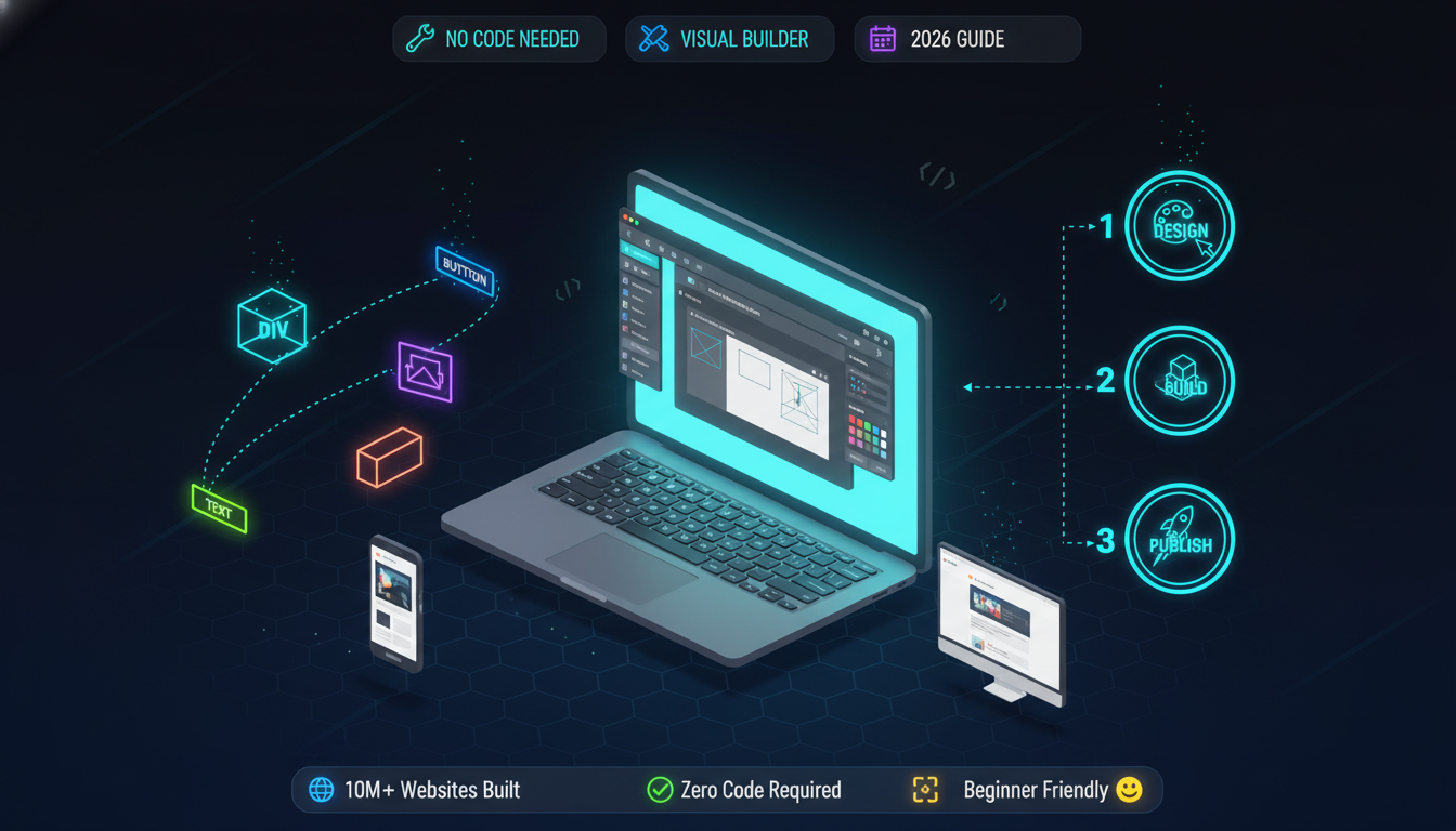
This is what Webflow design makes possible. It’s changing how people create websites in 2026, and I’m going to show you everything you need to know.
Let’s start with the basics. Webflow design is a tool that lets you build websites by pointing, clicking, and dragging things around on your screen.
Think about how you might arrange your room:
That’s exactly how Webflow design works! Instead of furniture, you’re arranging:
Webflow actually does three big jobs:
1. The Designer – This is where you build and design your site. It’s like your art studio.
2. The CMS (Content Manager) – This helps you organize your content, like blog posts or product pages. It’s like a filing cabinet.
3. The Hosting – This puts your site on the internet so everyone can see it. It’s like putting your artwork in a gallery.
All three work together to make your website complete!

You might wonder: “There are lots of website builders. What makes Webflow different?”
Great question! Let me explain with a story. Imagine you want to build a sandcastle. You have three options:
Option 1 (Like WordPress): You get some basic molds and tools, but you also need to find extra buckets, shovels, and decorations from different places. Some fit together well, others don’t.
Option 2 (Like Wix or Squarespace): You get a kit with everything included, but you can only build the exact castle shown on the box. No changes allowed.
Option 3 (Like Webflow): You get professional sand tools that let you build ANY castle you can imagine – simple or complex – but they’re easy enough that you don’t need to be an expert.
That’s Webflow design! It gives you professional power with beginner-friendly tools.
Here’s what makes Webflow awesome:
Speed: You can build a complete website in one afternoon instead of one month.
Control: Every single thing on your page can be exactly where you want it. Not “close enough” – exactly right.
Professional Look: Your site won’t look homemade. It will look like a professional designer built it.
Mobile-Friendly: Your site automatically adjusts to look good on phones, tablets, and computers.
No Limits: As you get better, you can build more complex things. The tool grows with you.
To understand the differences better, check out our comparison of WordPress vs custom design approaches. Let’s compare the popular options in a way that’s super easy to understand:
Good things:
Not-so-good things:
Best for: People who want beautiful, professional sites and don’t mind learning something new.
Good things:
Not-so-good things:
Best for: People who want a blog and don’t mind technical stuff.
Good things:
Not-so-good things:
Best for: Complete beginners who want something simple and fast.
Good things:
Not-so-good things:
Best for: Photographers and artists who want something pretty and simple.
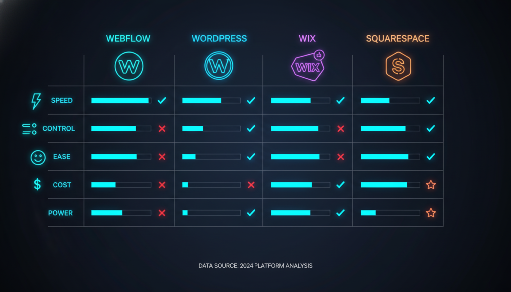
The Winner for 2026?
For most people who want to learn web design in 2026 properly, Webflow is the best choice, though WordPress website design is still popular for blogs and content-heavy sites.. It’s like learning to ride a real bike instead of a tricycle – a bit harder at first, but way more fun once you get it!
Okay, enough talking! Let’s actually DO something. Here’s how to start your Webflow design journey today.
Go to www.webflow.com and click the “Get Started” button. You’ll need:
It takes about 2 minutes. The free account lets you build 2 projects and learn everything!
After logging in, click “New Project.” Webflow will ask you a question:
“Do you want to start with a template or from scratch?”
My advice: Choose a template for your first project. It’s like having a coloring book with outlines already drawn. You can change everything, but you start with something that already looks good.
Pick a template that matches what you want to build:
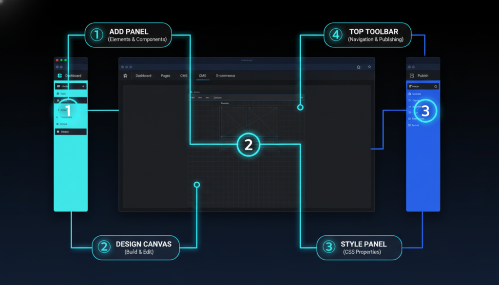
When your project opens, you’ll see the Webflow Designer. Let me walk you through each part:
Left Sidebar (The Add Panel): This is your toolbox. It has everything you can add to your page:
The Canvas (Middle): This is your workspace – where you actually build. It shows exactly what your website will look like.
Right Sidebar (The Style Panel): This is where you change how things look:
Top Toolbar: This has important buttons:
Let’s make a simple change to understand how it works:
Congratulations! You just edited your first website! 🎉
Every website – from Google to your favorite game site – is built from the same basic pieces. Let me show you what they are.
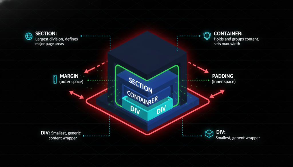
Here’s a secret about websites: Everything is a box!
Seriously. Even things that don’t look like boxes are actually boxes. Let me prove it:
In Webflow design, the three most common boxes are:
1. Section This is a BIG box. It holds a whole part of your page. Like:
2. Container This is a medium box that goes inside a Section. It keeps everything centered and organized nicely.
3. Div Block: This is a small box you can use for anything. It’s like a LEGO brick – super flexible!
Boxes stack inside each other like Russian nesting dolls:
This structure keeps everything organized!
There are two ways to add space around things:
Padding = Space INSIDE the box. Think of it like cushioning inside a gift box. It pushes the gift away from the box walls.
Margin = Space OUTSIDE the box. Think of it like the space between two gift boxes when you stack them.
In Webflow design, you can change both! Just click on something and look at the Style panel on the right. You’ll see options for margin and padding.
Pro tip: Start with small numbers like 10 or 20. You can always make them bigger!

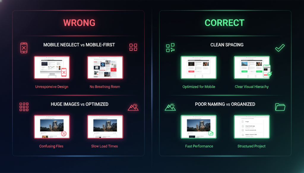
This is SUPER important in 2026: More people visit websites on phones than computers!
“Responsive” means your site changes size to fit different screens. Like how water fits into any container you pour it into!
In Webflow design, you design for different screen sizes:
Desktop (Computer): The biggest screen. You can fit lots of stuff side-by-side.
Tablet: Medium screen. Things start stacking vertically.
Mobile (Phone): Small screen. Everything stacks in one column.
See those little icons at the top of Webflow? They look like different devices. Click each one to design for that screen size:
Start with Desktop: Design everything for computer screens first. Make it look perfect.
Check Tablet: Click the tablet icon. Some things might look squished. Adjust the sizes and spacing.
Fix Mobile: Click the phone icon. This is where you’ll make the most changes. Make sure:
Important rule: Whatever you change on mobile ONLY affects mobile. It doesn’t mess up your desktop design!
Some designers actually start with the mobile design first, then work up to desktop. Why?
Because it’s easier to add things as screens get bigger than to remove things as screens get smaller! Try both ways and see what works better for you.
Your Webflow design must look good on small screens. Learn more about mobile-first responsive web design principles.
Now for the fun part – making your site beautiful!
Here’s a simple rule: Pick 3 colors and stick with them.
Color 1 (Main): Your brand color. Use it for important things like buttons and headings.
Color 2 (Accent): A complementary color. Use it sparingly for highlights.
Color 3 (Neutral): Usually gray or beige. Use it for backgrounds and text.
Where to find good colors?
In Webflow design, save your colors so you can reuse them:
Fonts are the style of your letters. Some look fancy, some look simple, some look fun!
Golden rule: Use only 1 or 2 fonts on your whole site.
Font 1: For headings and titles (can be fancy) Font 2: For body text (should be easy to read)
Good free fonts from Google Fonts:
In Webflow, changing fonts is easy:
Make sure people can actually read your text!
Headings:
Body Text:
Never go below 14px! Tiny text makes people squint and leave your site.
“White space” doesn’t mean white color – it means empty space between elements. Amateur designers fill every inch with stuff. Professional designers use lots of empty space.
Why? White space:
Give every element room to breathe. Don’t cram things together!
Now let’s add actual stuff to your site!
Text tips:
Good images make sites look professional!
How to add an image in Webflow design:
Image tips:
Buttons make your site interactive!
Creating a button:
Button best practices:
Links connect pages together!
To make text a link:
Link tips:
If you need something beyond Webflow’s capabilities, consider exploring custom website design options. Your website can have many different pages. Let’s look at the most common ones:
This is the first page people see. Make it count!
What to include:
Keep it simple! Don’t try to say everything on the homepage.
This is where you tell your story!
What to include:
Make it personal and friendly. Write like you’re talking to a friend!
How can people reach you?
What to include:
In Webflow design, adding a form is easy:
Share your thoughts, stories, or updates!
Webflow has a special CMS feature for blogs. It automatically creates:
We’ll talk more about this in the advanced section!
Want your site to look professional? Follow these rules:
Don’t just start clicking randomly! First, make a plan:
5 minutes of planning saves hours of rebuilding!
A style guide keeps everything consistent. Set these up first:
Colors: Pick your 3 colors and save them. Fonts: Choose your 2 fonts. Button styles: Design one button, then copy it everywher.e Spacing: Decide on standard padding/margins (like 20px, 40px, 60px)
With a style guide, your whole site looks like it belongs together!
Classes are like labels for your styles. When you style something in Webflow, you give it a class name.
Good class names:
Bad class names:
Why? Good names tell you what the element IS. Bad names tell you nothing!
Reuse classes! If you have 5 buttons that should look the same, give them all the same class. Then changing one changes all of them!
New designers often make this mistake: Adding too much stuff!
Less is more! A simple, clean site beats a cluttered one every time.
Always ask: “What does the visitor want?”
Pretend you’ve never seen your site before. Would you understand it?
The preview in Webflow is helpful, but nothing beats testing on real phones and tablets!
Before publishing:
Want to make your site feel alive? Add some movement!
Webflow design has a powerful feature called Interactions. This lets you make things move, fade, slide, and change!
Simple examples:
How to add a hover effect:
These are effects that happen as you scroll:
These make your site feel modern and engaging!
Don’t overdo it! Too many animations get annoying. Use them for important elements only.
Make moving between pages smooth:
These tiny details make your site feel polished!
Want to add a blog to your site? Webflow makes it easy with the CMS!
CMS stands for Content Management System. It’s a way to organize repeating content like:
Instead of making a new page for each blog post, you make ONE template. Then you just add new posts, and they automatically use that template!
Here’s how:
Step 1: Create a Collection
Step 2: Design the Blog List Page. This shows all your posts in a list. Add:
Step 3: Design the Blog Post Template This is how individual posts look. Add:
Step 4: Write Posts! Just add new items to your collection. They automatically appear on your blog!
What’s SEO? It means “Search Engine Optimization” – making your site show up when people search on Google!
Webflow design makes SEO easy. Here’s what to do:
1. Page Titles Each page needs a unique title. Click the settings gear:
2. Meta Descriptions This is the little preview text Google shows. Make it:
3. Headings Use heading tags properly:
4. Alt Text for Images: Describe each image. This helps:
5. Fast Loading Google loves fast sites! Speed tips:
6. Mobile-Friendly Google checks if your site works on phones. Make sure it does!
7. Good Content Write helpful, original content. Google ranks good content higher than junk!
Keywords are words people search for. For example, if you’re a dog trainer, your keywords might be:
Use these naturally in your:
Don’t force it! Write for humans first, Google second.
“Accessible” means everyone can use your site – including people with disabilities.
About 15% of people have some kind of disability. That might be:
Making your site accessible:
1. Use Enough Contrast. Text should be easy to read. Dark text on light backgrounds (or vice versa).
Test your colors at webaim.org/resources/contrastchecker
2. Make Everything Keyboard Accessible. Some people can’t use a mouse. They use the Tab key to move around.
Make sure:
3. Add Alt Text: Describe all images! Screen readers read this aloud to blind people.
4. Use Real Heading.s Don’t just make text big and bold. Use actual H1, H2, H3 tags. Screen readers use these to navigate.
5. Label Forms Clearly. Every form field needs a label explaining what goes there.
6. Don’t Use Color Alone. If something is important, don’t just make it red. Also use text, icons, or patterns.
In Webflow design, most accessibility features are built in! Just use them properly.
Everyone makes mistakes when learning. Here are the big ones to avoid:
The Problem: Your site looks great on your computer but terrible on phones.
The Fix: Always check mobile view! Click that phone icon frequently.
The Problem: Every section looks different. Buttons are all different colors and sizes. Five different fonts.
The Fix: Create a style guide and stick to it!
The Problem: You work for an hour, your browser crashes, and everything’s gone!
The Fix: Hit Cmd+S (Mac) or Ctrl+S (Windows) every few minutes!
The Problem: Your site loads super slowly because images are too big.
The Fix: Compress images before uploading! Use tinypng.com or squoosh.app.
The Problem: Your class list is a mess. You can’t find anything. Lots of duplicate styles.
The Fix: Use clear naming. Clean up unused classes. Be organized from the start!
The Problem: You copy a template but don’t understand how it works. Now you can’t change it!
The Fix: Take time to understand each part. Delete things and see what happens. Learn by doing!
The Problem: Your beautiful site gets zero visitors because Google can’t find it.
The Fix: Add page titles, descriptions, and alt text from the beginning!
The Problem: You accidentally delete something important and can’t undo it.
The Fix: Webflow has version history! You can restore old versions. Also, duplicate your project before making big changes.
Want to get better? Here are the best free resources:
This is Webflow’s official learning platform. It has:
Start with “Webflow 101” – it teaches everything step by step!
Website: university.webflow.com
Ran Segall (Flux Academy)
Finsweet
PixelGeek
Webflow’s Official Channel
The best way to learn? Build stuff!
Week 1 Project: Make a simple landing page about your favorite hobby
Week 2 Project: Build a 3-page portfolio site
Week 3 Project: Create a blog with 3 posts
Week 4 Project: Clone a famous website (like Apple’s homepage)
Don’t worry if they’re not perfect! You’re learning.
Look at good designs to get ideas:
Webflow Showcase – Sites built in Webflow Dribbble – Designer portfolios Awwwards – Award-winning websites Land-book – Landing page designs SiteInspire – Curated web design
Don’t copy exactly – get inspired and make it your own!
Webflow Forum – Ask questions, get answers. Webflow Facebook Groups – Share work, get feedback. Reddit r/webflow – Tips and discussions, Discord Servers – Real-time chat with other learners
Don’t be shy! Everyone was a beginner once. People love to help!
Let’s talk about money!
You can start completely free! The free plan gives you:
Limitations:
For learning, the free plan is perfect!
When you’re ready to launch a real site:
Site Plans (per website):
Account Plans:
My recommendation: Start free. When you need a real domain (like yourname.com), upgrade to Basic at $14/month.
Compared to other options:
Webflow is very reasonable, especially considering what you get!
Plus, you can build sites for others and charge them. Many people make money with Webflow design!
Ready to level up? Here are some pro techniques:
You can add custom HTML, CSS, or JavaScript to Webflow!
Click the page settings, go to “Custom Code,” and add your code. This lets you:
You don’t NEED to know code, but it’s there if you want more power!
Symbols are reusable elements. Perfect for:
Create it once, use it everywhere! When you edit the symbol, it updates everywhere automatically.
How to create a symbol:
This is the powerful animation system. You can create:
It takes practice, but the results are amazing!
We talked about blogs, but collections can do much more:
Anytime you have repeating content, use a collection!
Webflow can even handle online stores! You can sell:
It includes:
It’s not as full-featured as Shopify, but it’s great for simple stores!
Want to master Webflow design in one month?
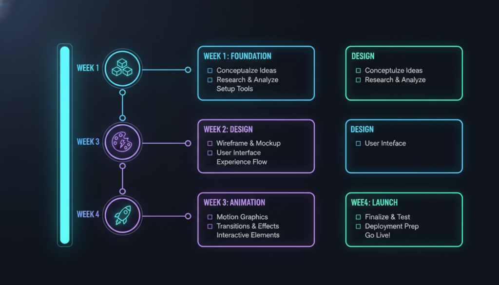
By day 30, you’ll know Webflow design well enough to build professional sites!
Learning something new is hard! Here’s how to stick with it:
1. Start Small. Don’t try to build the next Facebook. Build a simple one-page site first.
2. Set Clear Goals. “I will finish one tutorial every day” is better than “I will learn Webflow.”
3. Join the Community. Find other learners. Share your work. Get feedback. You’re not alone!
4. Celebrate Small Wins: Got your first button working? Celebrate! Published your first page? Tell someone!
5. Don’t Compare Someone else’s amazing site took months to build. Your day-3 site is supposed to be simple!
6. Take Breaks. If you’re frustrated, walk away. Come back fresh. Things often make more sense after a break.
7. Build Things You Care About: Make a site about your dog, your hobby, your favorite band. It’s more fun when you care about the topic!
8. Remember Why You Started. Write down why you wanted to learn web design. Look at it when you feel stuck.
Webflow design skills open many doors:
Freelancing: Build sites for local businesses, friends, and family. Charge $500-$5,000 per site!
Agency Work: Get a job at a web design agency. Starting salary: $40,000-60,000/year.
Start a Business: Offer web design as a service. Some Webflow designers make six figures!
Build Your Own Projects: Launch your blog, portfolio, online store, or side project.
Teach Others: Once you know Webflow, teach it! Make tutorials, courses, or write guides.
Consulting: Help companies improve their websites. Charge by the hour.
The skills you learn – design, layout, user experience – transfer to many careers!
What’s coming in 2025 and beyond?
AI Integration: Webflow is adding AI features to help you design faster. Imagine saying, “Create a hero section with a mountain background,” and it appears!
More Power: Advanced features for complex web apps, not just simple sites.
Better Collaboration: Teams working together in real-time, like Google Docs.
Improved CMS: More powerful content management with advanced relationships and filters.
Expanded E-commerce: Better tools for online stores competing with Shopify.
Voice Interfaces: Maybe someday you’ll design websites by talking!
The future is exciting, and Webflow design keeps getting better!
Building websites might seem scary at first. All those buttons, options, and technical terms!
But here’s the truth: Everyone who’s good at Webflow design started exactly where you are. They didn’t know anything. They felt confused. They made ugly websites at first.
The difference? They kept going.
You can build beautiful, professional websites. You can create things people love. You can even make money doing it!
All you need is:
Start today. Make something small. Learn one new thing. Come back tomorrow and do it again.
Before you know it, you’ll be building amazing sites and wondering why you ever thought it was hard!