Home / Blog Details
Take your digital marketing to the next level with data-driven strategies and innovative solutions. Let’s create something amazing together!


From Google search results to AI chatbots, we optimize your website so customers can find you faster — and choose you over competitors.
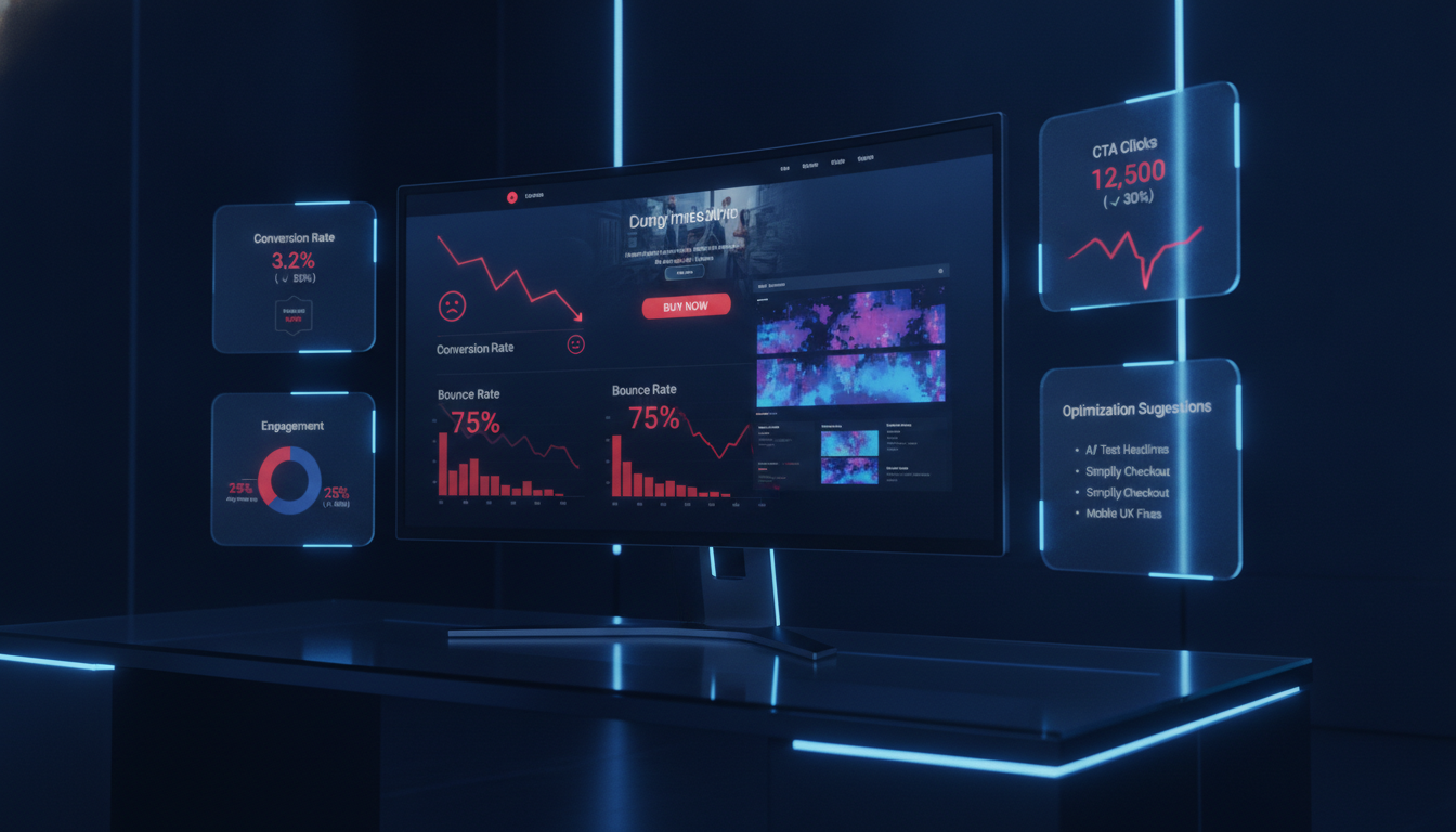
Your homepage is not converting because it fails to clearly communicate your value, guide visitors toward a next step, or build enough trust to earn an inquiry. Most homepages lose over 97% of visitors without capturing a single lead. The fix starts with messaging, not design.
Key Takeaways
You built a website, people are finding it, but the phone is not ringing. That is the single most frustrating problem a local service business owner can face. Your homepage is supposed to work as your best salesperson, available around the clock, and right now, it is sending prospects straight to a competitor.
The good news is that a homepage not converting is almost always a fixable problem. After auditing hundreds of local business websites for HVAC companies, law firms, dental practices, and home service providers across Lafayette, LA, the same handful of conversion gaps show up again and again. They are not mysterious, and most of them do not require a full site rebuild to correct.
In this guide, you will learn exactly why your homepage is failing to generate leads, how to diagnose whether the problem is traffic or conversion, and the specific fixes from messaging to mobile performance that move the needle fastest. By the end, you will know what to change and in what order.
Key Takeaways
The clearest sign is the gap between traffic and inquiries. If your Google Analytics shows consistent visitors but your call log and inbox stay quiet, your homepage is leaking leads.
Watch for these specific signals:
The math is straightforward. If your homepage gets 500 visitors per month and converts at 1%, you get 5 leads. Raise that to 3%, and you get 15 leads, no extra ad spend, no new traffic. According to research from Unbounce’s 2023 Conversion Benchmark Report, service businesses that optimize their homepage messaging see an average 30% lift in lead volume within 90 days.
Every month, your homepage underperforms is revenue walking out the door. A single missed HVAC install, legal consultation, or dental appointment can represent hundreds to thousands of dollars. That cost compounds quietly while you focus elsewhere.
Key Takeaways
Traffic is not the same as qualified interest. A homepage getting 2,000 monthly visitors from people searching informational keywords like “how does HVAC work” will always underperform compared to one getting 400 visitors searching “HVAC repair near me.”
Volume without intent is noise. The goal is not more visitors in isolation; it is more of the right visitors landing on a page built to convert them.
Open Google Search Console and look at the queries sending traffic to your homepage. If most of those queries are informational (“what is,” “how to,” “why does”), visitors are researching, not buying. Your homepage is not the right destination for them, and conversions will stay low regardless of how good your design is.
The fix here is not a homepage redesign. It is creating dedicated blog content to catch informational traffic and leaving your homepage to serve commercial-intent visitors who are ready to call or book.
In Google Analytics 4, segment your sessions by traffic source and compare conversion rates. Direct traffic and branded organic traffic almost always convert the highest. Paid traffic varies by campaign quality. Generic organic traffic is often the weakest converter.
If your conversion rate on branded traffic is reasonable but your overall rate looks terrible, the issue is traffic mix, not your homepage itself. This distinction changes your entire approach.
Key Takeaways
A value proposition is a one-sentence answer to: “Why should I hire you instead of the other guy?” Most local business homepages either skip it entirely or bury it below the fold.
If your headline says something like “Welcome to [Business Name]” or “Quality Service You Can Trust,” you do not have a value proposition. You have a placeholder. Visitors make their stay-or-leave decision in under 5 seconds (according to Nielsen Norman Group research). A generic headline fails that test every time.
A call to action (CTA) is any element that prompts a visitor to take a specific next step. Many homepages have CTAs that are too vague (“Learn More”), too hard to find (buried in a footer), or too passive to trigger a click.
Strong CTAs are specific, visible, and tied to what the visitor wants right now. “Get a Free Estimate Today” outperforms “Contact Us” because it tells visitors exactly what they will receive and when.
Trust signals are any element that reduces visitor doubt. They include customer reviews, star ratings, certifications, years in business, photos of your team, and recognizable logos (like Google Guaranteed or BBB accreditation).
For local service businesses, trust is the main barrier between a visitor and an inquiry. Someone looking for a lawyer or a dentist is making a high-stakes decision. Without social proof, they will find a competitor who looks more credible, even if your work is better.
As of 2024, over 60% of web traffic comes from mobile devices (Statcounter, 2024). If your homepage does not load cleanly on a phone, display readable text, or make your phone number easy to tap, you are losing more than half your potential leads before they even start reading.
Mobile issues often show up as: oversized images that push text off-screen, buttons too small to tap accurately, and pop-ups that block the entire screen on a phone. Each of these kills conversions silently.
Google’s own research found that a 1-second delay in mobile load time reduces conversions by 7%. A page that takes 5 seconds to load loses roughly 90% of its mobile visitors before they see anything (Google, 2023).
For local businesses, slow pages are usually caused by uncompressed images, too many third-party scripts, or a cheap hosting plan. These are solvable problems, and fixing them often produces an immediate conversion lift.
Friction is anything that makes it harder for a visitor to take the next step. Common friction points include: requiring visitors to fill out a 10-field form to ask a simple question, hiding contact information, forcing visitors through multiple clicks to find a phone number, and auto-playing videos that slow page load.
Every unnecessary step you add between a visitor and an inquiry costs you leads. The goal is to make it as easy as possible for a ready buyer to reach you.
Key Takeaways
Your homepage should answer three questions in the first screen a visitor sees: What do you do? Who do you help? Where do you serve them? If any of these are unclear, you are making visitors work harder than they should.
For example: “We install and repair HVAC systems for homeowners in Lafayette, LA” is clear. “We provide comprehensive climate solutions” is not. Plain language always outperforms industry jargon.
Features describe what your service includes. Benefits describe what the customer gets from it. Features say “24/7 emergency service.” Benefits say, “We pick up the phone at midnight when your AC stops working.”
Local service buyers are emotionally driven. They are hot, worried, in pain, or under stress. Speaking to their outcome, not your process, builds the connection that drives a call.
Start every headline with the visitor’s problem or desired outcome, not your company name or credentials. Instead of “Lafayette’s Trusted HVAC Company Since 1998,” try “Get Your AC Fixed Today Licensed Technicians, Serving Lafayette.”
The formula is simple: [Outcome or Problem] + [Your Solution] + [Proof or Location]. Apply this across your hero headline, your section headings, and your CTAs for a consistent, persuasive message.
The 5-second test is a simple usability technique. Show someone your homepage for exactly 5 seconds, then ask: “What does this company do? What would you click next?” If they cannot answer confidently, your messaging is not doing its job.
If the answer to the first question is vague, “something about home services?” your headline and subheadline need rewriting. Be specific about the service and the location before you say anything else.
If visitors cannot name a specific action to take, “call them,” “fill out the form,” “get a quote,” your CTA is either invisible or unclear. The next section covers exactly how to fix that.
Key Takeaways
Above the fold refers to everything a visitor sees before scrolling. These are the elements every local service homepage needs in that space:
The most common mistake is a full-screen hero image with no text. It looks beautiful in a portfolio, but it communicates nothing to a first-time visitor in a hurry.
Other mistakes include: a hero headline that names the company before stating the service, a CTA that says only “Contact Us” with no specific offer, and a phone number that is not clickable on mobile. Each of these reduces the chance a visitor takes action.
If a visitor arrives from an “HVAC repair Lafayette” search, your hero should reflect that specific service. A generic “full-service home improvement” headline creates friction because it does not confirm that you do what they searched for.
The closer your headline mirrors the intent behind the search, the lower your bounce rate and the higher your conversion rate. This is one of the easiest wins in conversion rate optimization (CRO).
Key Takeaways
After auditing local service homepages across multiple industries in Lafayette, LA, the section order that consistently performs best is:
Each section of your homepage should answer the next question a skeptical visitor has. The hero answers: “What do you do?” The services section answers: “Do you do what I need?” Social proof answers: “Can I trust you?” The CTA answers: “What should I do now?”
When sections are out of order, like leading with a company history before stating your services, you create a narrative that serves you, not the visitor. Always build for the buyer’s sequence, not your own.
Navigation is a necessary part of a homepage, but it also gives visitors an exit. Every link in your menu is a way to leave your conversion path. Trim your top-level navigation to the five most important pages. Move lesser-used links to your footer.
“Sticky” navigation that follows visitors as they scroll keeps your CTA and phone number visible at all times. This single change has produced measurable conversion lifts on local business homepages without any other changes.
Visual clutter is anything that competes for the visitor’s attention without pushing them toward an action. Rotating sliders, stock photo galleries, excessive animation, and long blocks of unbroken text all raise cognitive load.
A clean homepage with generous white space, clear hierarchy, and one dominant CTA will almost always outperform a busy homepage filled with widgets and design effects. When in doubt, remove it.
Key Takeaways
Replace vague CTAs with copy that names the visitor’s outcome. Compare these two options: “Submit” versus “Get My Free Estimate.” The second tells visitors exactly what happens when they click and frames it as a benefit to them, not a form submission for you.
Start CTA buttons with a verb: Get, Schedule, Request, Book, Call. Follow it with the specific outcome: a quote, an appointment, a consultation, or an estimate. Add a time cue where relevant: Today, Now, in 60 Seconds.
Not every visitor is ready to call. Some are early-stage researchers; others are ready to book. Offering only one CTA type, like a phone number, excludes visitors who prefer to inquire by form or chat.
For local service businesses, the best combination is a primary CTA (call or form for ready buyers) paired with a softer secondary CTA (“See Our Work” or “Read Reviews”) for visitors who need more convincing.
A compelling offer reduces the risk for the visitor. Free estimates, free consultations, money-back guarantees, and same-day service commitments all lower the barrier to reaching out. For a first-time visitor, an offer that costs nothing removes the biggest objection to contact: “What if I spend time on this and it does not work out?”
Be specific. “Free 30-Minute HVAC Inspection” is more compelling than “Free Consultation” because it tells visitors exactly what they will receive and how long it takes.
At minimum, place CTAs in three locations: in the hero section (before any scrolling), at the end of the social proof section (right after trust is established), and just above the footer (catching visitors who scroll the full page before deciding).
For longer homepages, add a fourth CTA in or immediately after the services overview. Visitors who identify their needed service are often ready to act at that moment give them the opportunity.
Key Takeaways
Display real reviews with the reviewer’s full name, a star rating, and a date. Generic testimonials with no name or date (“Great service! John D.”) read as fabricated to today’s savvy buyer.
Pull 3-5 of your best Google reviews and embed them directly on your homepage. If your rating is 4.5 stars or higher, display it prominently above the fold; it works as a trust signal before visitors even read the review text.
Case studies, brief before-and-after stories from real clients, are more persuasive than any other trust element because they show specific results. For a law firm, “We helped a Lafayette family recover $240,000 after a commercial truck accident” is more convincing than ten generic five-star reviews.
Even a two-paragraph success story, paired with the client’s first name and service type, builds credibility that generic testimonials cannot match. Use them on your homepage whenever your client allows you to.
Yes, always. For service businesses in regulated industries, such as HVAC, legal, dental, electrical, and plumbing, displaying your licensing and certification information signals to visitors that you are legitimate and compliant.
Place certification logos in the hero section or directly below it. A BBB accreditation badge, a Google Guaranteed badge, or a state contractor license number answers the trust question before it is even asked.
Real team photos outperform stock photos consistently in conversion testing. When visitors see the actual person who will show up at their home or office, anxiety decreases and trust increases. This is especially true for home service businesses where a stranger is entering a private space.
Add a brief, personal “About Us” section with a real team photo, your founding story in 2-3 sentences, and your service commitment. It is one of the least expensive, highest-impact additions to a local business homepage.
At minimum, your hero section should include: a star rating from Google Reviews with the review count (e.g., “4.8 stars, 120+ reviews”), at least one credentialing logo relevant to your industry, and a short social proof statement (“Serving Lafayette families since 2009”).
Trust signals above the fold reduce the “is this company real and legitimate?” doubt immediately. Visitors who do not doubt your legitimacy stay longer and convert at higher rates.
Key Takeaways
For a first-contact form on a homepage, ask only for what you need to initiate a conversation: name, phone number, service needed, and optionally a brief message. That is 3-4 fields maximum.
Research from Formstack’s 2023 form conversion report found that forms with 3 or fewer fields convert at nearly double the rate of forms with 6 or more fields. Every additional field is an opportunity for the visitor to abandon the form.
The most common form mistakes on local business homepages include: asking for a budget upfront (signals nickel-and-diming), requiring a detailed project description before any contact (too much work), using a generic “Submit” button instead of a specific CTA, and placing the form below the footer, where it is invisible.
Another common mistake: no confirmation message after submission. If a visitor submits a form and nothing visible happens, they assume it broke. A simple “Thank you, we will call you within 2 business hours” message reduces anxiety and sets expectations.
Add a brief privacy assurance below the form: “We never share your information. No spam, ever.” For high-stakes services like legal or dental, add a single sentence of social proof next to the form: “Join 400+ Lafayette families who chose us.”
Consider using a two-step form for longer inquiries. Show only 2-3 fields initially, then load additional fields after the first click. The first click creates a micro-commitment, and form abandonment drops significantly.
Key Takeaways
Mobile-first means designing and testing for the phone experience before the desktop. Start by viewing your homepage on an actual phone, not a desktop browser’s mobile simulation. Check: Is your phone number clickable (tel: link)? Is the CTA button large enough to tap with a thumb? Does your text size require zooming to read?
Beyond layout, check your font size (minimum 16px body text on mobile), your button size (minimum 44x44px tap target), and the spacing between clickable elements. Crowded elements lead to mis-taps, frustration, and exits.
Core Web Vitals are Google’s three key performance metrics: Largest Contentful Paint (LCP), which measures how fast your main content loads; Interaction to Next Paint (INP), which measures responsiveness; and Cumulative Layout Shift (CLS), which measures visual stability.
A poor LCP score (above 4 seconds) means visitors wait too long before seeing meaningful content. A high CLS score means page elements jump around during load, which causes mis-clicks and erodes trust. You can check your Core Web Vitals for free using Google’s PageSpeed Insights tool (pagespeed.web.dev).
Start with images. Most local business homepages contain hero images sized for a 4K screen, served uncompressed to every visitor. Convert all images to WebP format and compress them to under 100KB each. For a typical homepage, this step alone can cut load time by 2-4 seconds.
Next, audit your third-party scripts. Every chat widget, analytics pixel, and social media button adds HTTP requests and load time. Keep only what is essential. Defer non-critical scripts, so they load after the main page content. Use your hosting CDN to serve assets from the closest server to your visitor.
Key Takeaways
Here is a direct comparison of how these two page types work:
| Feature | Homepage | Landing Page |
| Purpose | Brand hub, multiple goals | Single conversion goal |
| Navigation | Full menu with links | Minimal or none |
| Audience | All visitors | Specific campaign traffic |
| CTAs | Multiple actions possible | One focused CTA |
| Best for | Organic and direct traffic | Paid ads, email campaigns |
| Conversion rate avg. | 1-3% for service businesses | 5-15% for focused offers |
A landing page converts better any time you are sending traffic from a specific source to a specific offer. Google Ads campaigns, Facebook lead ads, email blasts, and direct mail with a URL all belong on a dedicated landing page, not your homepage.
The reason is focus. A homepage has navigation, multiple CTAs, and content for many audiences. A landing page has one goal, one CTA, and zero distractions. For a paid campaign where every click costs money, that focus translates directly into a lower cost per lead.
The most effective local business web strategy uses the homepage to capture organic and direct traffic, and dedicated landing pages to capture paid and referral traffic.
Your homepage builds the brand foundation. Landing pages convert specific campaigns. Internal links from landing pages back to your homepage and service pages also pass authority and help both rank better in organic search. Both tools earn their keep just in different ways.
Key Takeaways
Conversion rate is the percentage of visitors who take a desired action (call, form submission, chat initiation). For local service business homepages, a baseline of 2-5% is typical. Well-optimized homepages in high-intent niches (legal, medical, emergency services) can reach 8-12%.
If your rate is below 1%, start with messaging and trust signals. If it is between 1-3%, focus on CTA placement and mobile experience. Above 3% is strong for most local niches, though there is always room to improve.
Bounce rate tells you how many visitors leave after viewing only one page. A rate above 70% for a homepage is a signal that the page is failing to engage. However, bounce rate alone is incomplete; a visitor who reads your homepage for 3 minutes and then calls from their phone registers as a bounce in some analytics configurations.
Scroll depth shows you how far down the page visitors read. If 80% of visitors never scroll past your hero section, everything below it is invisible to most of your audience. This is a critical insight because it tells you not to put your best social proof at the bottom of the page.
Form submission rate is the percentage of visitors who see your form and complete it. Track this separately from the overall conversion rate. If your overall conversion rate is low but your form submission rate among visitors who see the form is high, the issue is visibility; move the form higher on the page.
If visitors see the form but abandon it, the issue is friction in the form itself. If visitors reach the form but do not submit it, check for technical errors first. A broken form is an invisible revenue leak.
Heatmaps show you aggregate click, scroll, and hover data across many visitor sessions. They visually highlight what visitors engage with (hot zones) and what they ignore (cold zones). A CTA button that shows no heat is being missed entirely.
Session recordings let you watch anonymized replays of individual visitor sessions. You can see where people stop scrolling, where they move their mouse in confusion, and where they abandon the page. Tools like Microsoft Clarity (free) and Hotjar provide both features and are easy to install on most local business websites.
Key Takeaways
For local service businesses in Lafayette, LA, and surrounding areas, the most common homepage conversion gaps are: no visible phone number in the header, no Google review count displayed, no mention of specific neighborhoods or zip codes served, and no licensing information for regulated trades.
These gaps cost leads because local buyers are risk-averse. They want to know you are real, local, licensed, and that other people in their community have used you. Without these signals, even a well-designed homepage fails to convert.
Pull your Google Business Profile reviews and embed the best 3-5 on your homepage. Include the reviewer’s name, their neighborhood (“John R., Scott Street”), and the date. This specificity signals authenticity and reinforces your local presence.
For case studies, focus on outcomes relevant to your service area. “We helped a family near Duson recover $180,000 after a dog bite injury” resonates more with a local audience than a generic case study because it places the result in a context they recognize.
Your service area should appear in at least three places on your homepage: the hero headline or subheadline, a dedicated “Areas We Serve” section with a list of zip codes or neighborhoods, and the footer.
Your phone number should be clickable on mobile and visible in the sticky header on all devices. Your physical address, if you have one, should appear in the footer with a Google Maps embed link. For businesses without a storefront, a service area map is a strong substitute.
A homepage not converting is not a single problem; it is usually a cluster of small, fixable gaps that compound over time. The highest-impact starting point for most local service businesses is messaging: a clear headline, a specific value proposition, and a visible CTA. Get those three elements right, and you will see a measurable lift before you touch anything else.
From there, layer in trust signals, mobile optimization, and form improvements. Use real data from Google Analytics, Google Search Console, and a free heatmap tool to guide your priorities. Do not guess about what is broken; measure it, then fix it in order of impact.
At Sites N Apps, we have audited and rebuilt web design and conversion strategies for local service businesses across Lafayette, LA, in HVAC, legal, dental, and home services. We know exactly where local homepages lose leads and how to recover them. If your homepage is getting traffic but not converting, we would be glad to take a look. Book a free homepage audit with our team, and we will tell you in plain terms what is costing you leads and what to fix first.
Traffic without leads usually means a mismatch between what visitors expect and what your homepage delivers. Check your value proposition, CTA visibility, and trust signals first. If those are solid, evaluate whether the traffic itself is qualified; informational visitors rarely convert on a service homepage.
Messaging and CTA changes can show results within days. Technical fixes like page speed improvements typically show results within 2-4 weeks as Google re-indexes your pages. Cumulative trust-building (reviews, case studies) improves conversion gradually over 60-90 days.
Start with the homepage before investing in a full redesign. Fix the highest-impact elements first: headline, CTA, trust signals, and mobile performance. If those fixes do not move the needle after 60-90 days, a full redesign may be warranted. A redesign without a conversion strategy often repeats the same mistakes.
Set up goal tracking in Google Analytics 4 for CTA button clicks and form submissions. Use a heatmap tool like Microsoft Clarity (free) to see whether visitors are clicking your CTA at all. If the button gets zero or minimal clicks, the issue is visibility or relevance, not the offer itself.
For local service homepages, 2-5% is a realistic baseline for a well-optimized page. High-intent niches like emergency plumbing, legal, or urgent dental can see 6-10% on strong campaigns. If you are below 1%, the page has a foundational problem that needs immediate attention, starting with messaging.
Yes, directly. Google’s data shows that a 1-second delay in mobile load time reduces conversions by 7%. For a homepage getting 500 visitors per month at a 3% conversion rate, a 2-second slowdown can cost you 3-4 leads per month. Page speed is both an SEO and a revenue issue for local service businesses.
Struggling to compete for high-search-volume keywords? We help businesses like yours increase visibility, drive more traffic, and dominate competitive search terms—all while keeping your costs low. Our proven strategies focus on long-term growth and measurable results.