Home / Blog Details
Take your digital marketing to the next level with data-driven strategies and innovative solutions. Let’s create something amazing together!


From Google search results to AI chatbots, we optimize your website so customers can find you faster — and choose you over competitors.
Lafayette, LA, is a growing market. More local customers are searching on their phones than ever before. If your website does not work well on mobile, you are losing business every day.
This guide covers everything Lafayette business owners need to know about responsive web design, from what it means to how it directly impacts your local search rankings, customer experience, and revenue.
Responsive web design is an approach where a website automatically adjusts its layout, images, and content to fit any screen size. Whether a visitor opens your site on a desktop, tablet, or smartphone, the experience stays clean and functional.
There is no separate mobile site. One website works across all devices. The design responds to the screen it is being viewed on.
Local customers make fast decisions. When someone searches for a plumber, restaurant, or doctor in Lafayette, they expect to find a website that loads fast and is easy to use on their phone.
A site that is hard to navigate on mobile pushes visitors away. A responsive site keeps them engaged and moves them toward contacting your business.
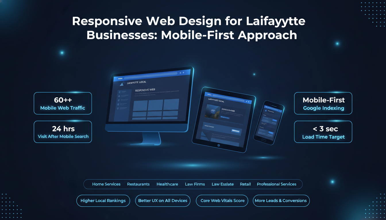
Over 60 percent of all web traffic now comes from mobile devices. Local searches have an even higher mobile share. Studies show that most people who search for a local business on their phone visit or contact that business within 24 hours.
If your website is not optimized for mobile, you are invisible to a large portion of your potential customers in Lafayette.
Lafayette is a competitive market across industries like home services, healthcare, food and beverage, and professional services. A responsive website is not optional anymore. It is a basic requirement for competing locally.
Customers expect a smooth experience no matter what device they use. A site that looks broken on a phone signals unprofessionalism. Responsive design ensures your business makes the right impression every time.
Your website is often the first thing a potential customer sees. A mobile-friendly layout with clear information, readable text, and easy navigation creates immediate trust. A cluttered or broken mobile layout does the opposite.
User experience directly affects whether someone stays on your site or leaves. Responsive design improves readability, reduces scrolling friction, and makes it easier for Lafayette visitors to find what they need quickly.
Traffic means nothing without conversions. A responsive website is built to convert mobile visitors into calls, form submissions, or walk-in customers. Buttons are tappable. Forms are simple. Contact information is easy to find.
Understanding your local competition helps you make smarter decisions about your own website.
Many established Lafayette businesses have already invested in responsive web design. They appear higher in local search results, load faster on mobile, and provide better experiences to potential customers.
Not every business in Lafayette has made the switch. Many small and mid-sized businesses still run outdated websites that perform poorly on mobile. This is an opportunity. A well-designed responsive website can help you outrank competitors and capture their missed traffic.
When a potential customer lands on a slow or broken mobile website, they leave and go to a competitor. Every day your website underperforms, you are handing business to someone else in Lafayette.
A responsive website is one of the strongest foundations for local SEO. Google uses mobile-first indexing, which means it primarily evaluates the mobile version of your site when determining rankings.
Google officially uses mobile friendliness as a ranking signal. Websites that provide a good mobile experience rank higher in local search results. For Lafayette businesses targeting local customers, this directly impacts visibility in Google Maps and the local pack.
Google tracks how users interact with your site. If mobile visitors leave quickly, that sends a negative signal. If they stay, browse, and convert, that tells Google your site is valuable. Responsive design improves these engagement signals.
Core Web Vitals measure page loading speed, visual stability, and interactivity. Google uses these metrics as ranking factors. Responsive websites built with performance in mind score better on Core Web Vitals and rank more competitively in search results.
Schema markup helps Google understand your business information, including your name, address, phone number, hours, and services. Adding local business schema to a responsive website improves your chances of appearing in AI overviews, featured snippets, and rich results for Lafayette searches.
Your Google Business Profile drives traffic to your website. If that website is not mobile-friendly, visitors bounce. A responsive website ensures that traffic from your Google Business Profile converts into real leads.
Not all responsive websites are built the same. These are the features that separate a high-performing local business website from an average one.
A flexible grid layout adjusts content blocks based on screen size. Text, images, and sections stack or rearrange so the site always looks intentional, not broken.
Mobile users navigate with their fingers. Buttons, menus, and links need to be large enough to tap without frustration. Calls to action like “Call Now” or “Get a Free Quote” need to be visible and easy to reach on every page.
One of the most important features for a local business website is a click-to-call button. When someone on a mobile device is ready to reach out, one tap should connect them. Contact forms should be short, simple, and mobile-optimized.
A responsive website must load fast. Images should be compressed and properly sized for mobile. Unnecessary scripts should be removed. Slow load speeds hurt both user experience and search rankings.
Lafayette customers often need to find your physical location. An embedded map, clear address, and directions link make it easy. Location-focused features also reinforce your relevance in local search.
Google gives preference to secure websites. An SSL certificate keeps user data protected and signals trustworthiness. For local businesses collecting contact form submissions or phone numbers, HTTPS is essential.
Mobile-first design means building your website for the smallest screen first, then scaling up. This approach results in faster, cleaner, and more effective websites.
When you design for mobile first, you prioritize what matters most. Every element earns its place. This approach naturally leads to cleaner layouts, faster load times, and better overall performance across all devices.
Breakpoints are points in the design where the layout shifts to accommodate a different screen size. A well-built responsive website uses breakpoints for mobile phones, tablets, and desktop screens so the experience is optimized at every size.
Content on mobile needs shorter paragraphs, larger font sizes, and a clear visual hierarchy. Headers guide the reader. White space reduces overwhelm. Well-formatted content keeps mobile visitors engaged longer.
Navigation menus on mobile should be simple and accessible. Hamburger menus, sticky headers, and clearly labeled links help users find what they need without frustration. Poor navigation is one of the top reasons mobile users leave a website.
Different industries have different needs. Here is how responsive design applies across common Lafayette business types.
Plumbers, electricians, HVAC companies, and other home service providers in Lafayette rely heavily on mobile search. Customers in an emergency need to find and call a service provider fast. A responsive website with a prominent click-to-call button and clear service areas is essential.
Restaurant and retail customers check menus, hours, and locations from their phones before visiting. A mobile-optimized website with updated hours, an easy-to-read menu, and map integration directly impacts foot traffic and sales.
Patients in Lafayette search for doctors, dentists, and clinics on mobile devices. A responsive healthcare website with online appointment booking, clear service listings, and easy contact options improves patient acquisition and retention.
Law firms, real estate agents, and financial professionals need websites that build trust quickly. A clean, responsive design with clear credentials, service descriptions, and contact options positions these businesses as credible and professional.
Salons, gyms, tutoring centers, and other local service businesses benefit from responsive design features like online booking, service menus, and customer testimonials, all formatted for easy mobile viewing.
Responsive web design is not just a technical upgrade. It produces measurable business outcomes.
Businesses that switch from outdated websites to responsive designs typically see improvements in search rankings, time on site, and lead volume. A faster, cleaner site that works on mobile directly reduces the number of visitors who leave without taking action.
After a responsive redesign, Lafayette businesses commonly report lower bounce rates, more phone calls from mobile visitors, higher rankings in local search, and improved conversion rates on contact forms.
Local business owners who have invested in responsive web design consistently note that their websites now work as a lead generation tool rather than just an online placeholder. The shift from a static, outdated site to a responsive one changes how customers engage with their brand.
If you are unsure whether your current website is performing well on mobile, look for these warning signs.
A high bounce rate from mobile visitors means people are landing on your site and leaving immediately. This usually signals that the mobile experience is poor. Google Analytics can show you bounce rates segmented by device type.
If your website takes more than three seconds to load on mobile, you are losing visitors. Page speed is both a user experience issue and a ranking factor. Slow sites perform poorly in local search.
Fixed-width layouts, tiny text, and horizontal scrolling are signs of an outdated website. These issues frustrate mobile users and make it harder for them to take the action you want.
If your menus are difficult to use on a phone, or if buttons are too small to tap accurately, your site is not mobile-friendly. Navigation problems are a direct cause of lost leads.
Even well-intentioned website redesigns can fall short. These are the most common mistakes Lafayette businesses make.
Fixed-width designs do not adapt to different screen sizes. They were common years ago but are now outdated. They cause horizontal scrolling and broken layouts on mobile devices.
Many businesses focus on how a site looks but ignore how fast it loads. Mobile page speed directly affects rankings and user experience. Images, scripts, and fonts all need to be optimized.
Menus that are hard to find, too small to tap, or poorly organized frustrate mobile users. Navigation should always be a priority in the design process, not an afterthought.
Large, uncompressed images are one of the most common causes of slow mobile websites. Every image on your site should be resized and compressed for web use without sacrificing quality.
Accessibility means designing for all users, including those with visual impairments or motor limitations. Touch targets should be large enough, contrast should be sufficient, and text should be readable without zooming. Accessible design also supports better SEO.
Some older approaches to mobile optimization involved creating a separate mobile version of a website. Here is why responsive design is the better choice.
A separate mobile site lives on a different URL, usually with an “m.” prefix. It requires separate updates and maintenance. A responsive website is a single site that adapts to all screen sizes automatically.
Google recommends responsive web design over separate mobile sites. With one URL, your link equity is consolidated. You avoid duplicate content issues. You maintain a single, authoritative site that ranks better in search.
Maintaining two separate websites costs more over time. A responsive design requires one round of updates and applies across all devices. It is more cost-effective, easier to manage, and better supported by Google.
Your website’s job is to turn visitors into customers. Responsive design plays a direct role in how well it does that.
Every extra tap, slow load, or confusing layout adds friction. Friction causes drop-offs. Responsive design removes barriers so visitors can move smoothly from landing on your site to contacting your business.
Mobile-optimized contact forms are shorter and easier to complete. Click-to-call buttons remove the need to manually dial a number. These small features have a significant impact on how many leads your site generates.
A well-designed responsive website communicates professionalism and credibility. When a visitor has a smooth, clean experience on your site, they are more likely to trust your business and reach out.
More mobile traffic is converting. Businesses with responsive websites capture more of that traffic as leads. Over time, a higher conversion rate from mobile visitors translates directly into increased revenue.
The platform your website is built on affects how easily it can be maintained, updated, and scaled.
WordPress is the most widely used CMS in the world. It supports thousands of responsive themes and plugins. For Lafayette businesses that want flexibility, scalability, and strong SEO capabilities, WordPress is a reliable choice.
Squarespace and Wix offer beginner-friendly, template-based responsive designs. They are easier to set up but offer less flexibility. Custom-built websites give you full control over design, performance, and functionality, but require more investment upfront.
The right platform depends on your budget, technical comfort level, and business goals. A simple service business may do well on WordPress with a premium theme. A business with complex needs may benefit from a fully custom-built responsive website.
A good responsive website is not a one-time project. Content needs to be updated, plugins kept current, and performance monitored. Choose a CMS that your team can manage or work with a local Lafayette web design partner for ongoing support.
Understanding what a responsive website costs and what it returns helps you make a confident investment decision.
Cost depends on the number of pages, the complexity of the design, the platform used, custom features required, and the experience level of the designer or agency. A basic responsive website starts lower than a fully custom-built site with advanced functionality.
For most Lafayette small to mid-sized businesses, a professional responsive website investment ranges based on scope and complexity. Template-based builds cost less. Custom designs with SEO optimization, performance tuning, and content creation cost more but deliver greater long-term value.
A responsive website generates ROI by capturing more mobile traffic, converting visitors into leads, improving local search rankings, and reducing the customer acquisition cost over time. A website that consistently generates leads pays for itself.
Measuring results is critical. Without data, you cannot know if your responsive website is working.
Google Analytics shows you how mobile visitors behave on your site. You can see bounce rates, session duration, pages visited, and conversions broken down by device. This data tells you what is working and what needs improvement.
Google Search Console shows how your site performs in search. You can see which keywords bring traffic, how your pages rank, and whether Google has flagged any mobile usability issues. It is an essential tool after a responsive redesign.
Track mobile bounce rate, average session duration, goal completions, page load speed, and organic search traffic. Improvements in these metrics confirm that your responsive website is delivering results.
Picking the right web design partner in Lafayette is one of the most important decisions you will make for your online presence.
Look for a team with a strong portfolio of responsive websites, experience with local SEO, transparent pricing, and a clear process. They should ask questions about your business goals, not just your design preferences.
Ask about their mobile-first design process, how they handle page speed optimization, what platform they build on, what is included after launch, and how they measure success. A qualified web design company will have clear answers.
Custom websites are built from the ground up to match your brand and goals. Template solutions are faster and cheaper but may limit flexibility. For businesses in competitive Lafayette markets, a custom responsive website often provides a stronger long-term advantage.
A web design company with experience in the Lafayette market understands local search behavior, competitors, and customer expectations. Local knowledge can inform better design decisions and a more effective local SEO strategy.
If you are looking for a trusted partner, Sites N Apps is a Lafayette-based web design agency that helps local businesses build responsive websites that rank and convert. Explore our web design services in Lafayette to see how we can help your business grow online.
You do not need to guess whether your website is mobile-friendly. These tools give you clear answers.
Google’s Mobile-Friendly Test tool analyzes your website and tells you whether it meets mobile usability standards. It also highlights specific issues that need to be fixed. PageSpeed Insights gives you performance scores for both mobile and desktop.
Open your website on multiple devices, including an Android phone, an iPhone, and a tablet. Check how pages load, how navigation works, and whether all content is readable without zooming or horizontal scrolling.
Use Google Search Console or PageSpeed Insights to check your Core Web Vitals scores. Focus on Largest Contentful Paint, Cumulative Layout Shift, and Interaction to Next Paint. These scores directly impact your search rankings.
After running your tests, prioritize fixes based on impact. Address speed issues first, then navigation and layout problems, then content formatting. A systematic approach to improvement produces the best results.
Responsive design continues to evolve. Staying ahead of these trends helps Lafayette businesses maintain a competitive edge online.
AI is beginning to play a role in how websites adapt to individual users. Personalized content, dynamic layouts, and AI-driven recommendations are becoming more common. Businesses that adopt these technologies early will have an advantage.
Foldable phones, smart displays, and wearable devices are changing what responsive design needs to account for. Future-ready websites are built with flexibility to adapt to screen sizes and device types that do not yet dominate the market.
Web accessibility standards are becoming stricter. Inclusive design, which considers users with disabilities from the start of a project, is becoming a standard expectation rather than an optional add-on. Accessible responsive websites also perform better in search.
Yes. Google uses mobile-first indexing, which means the mobile version of your site is what Google primarily evaluates for ranking. A responsive website directly supports your local SEO performance in Lafayette.
In many cases, yes. Depending on the platform and how the site was originally built, a developer can apply responsive design principles to an existing site. In other cases, a full redesign is the more practical and cost-effective path.
At a minimum, review your website every 12 to 18 months. Technology changes, design standards evolve, and your business offerings may shift. Regular updates keep your site competitive and maintain strong performance in search.
A typical responsive website redesign for a local Lafayette business takes between four and twelve weeks, depending on the scope, number of pages, and how quickly content and approvals are provided.
WordPress is a strong choice for most small businesses due to its flexibility, SEO support, and wide range of responsive themes. Squarespace or Wix may suit businesses that need simplicity over customization.
Cost varies based on scope and the design partner you choose. Basic responsive websites start at a lower investment, while custom-built sites with SEO and performance optimization represent a higher but more strategic investment. Focus on value and long-term ROI rather than the lowest price.
A responsive website is the foundation of your digital presence. It affects how customers find you, how they experience your brand, and whether they choose to contact you. In a growing market like Lafayette, LA, businesses that invest in mobile-friendly web design gain a real competitive advantage in local search and customer acquisition.
Start by testing your current website on mobile. Identify your biggest issues. Then work with a qualified web design partner to build or redesign a responsive website that performs in search and converts visitors into customers.
Sites N Apps specializes in responsive web design for Lafayette businesses. From mobile-first builds to full redesigns, we create websites that perform in local search and turn visitors into leads. Visit our web design services in Lafayette page and take the first step toward a website that works as hard as you do.
Struggling to compete for high-search-volume keywords? We help businesses like yours increase visibility, drive more traffic, and dominate competitive search terms—all while keeping your costs low. Our proven strategies focus on long-term growth and measurable results.